
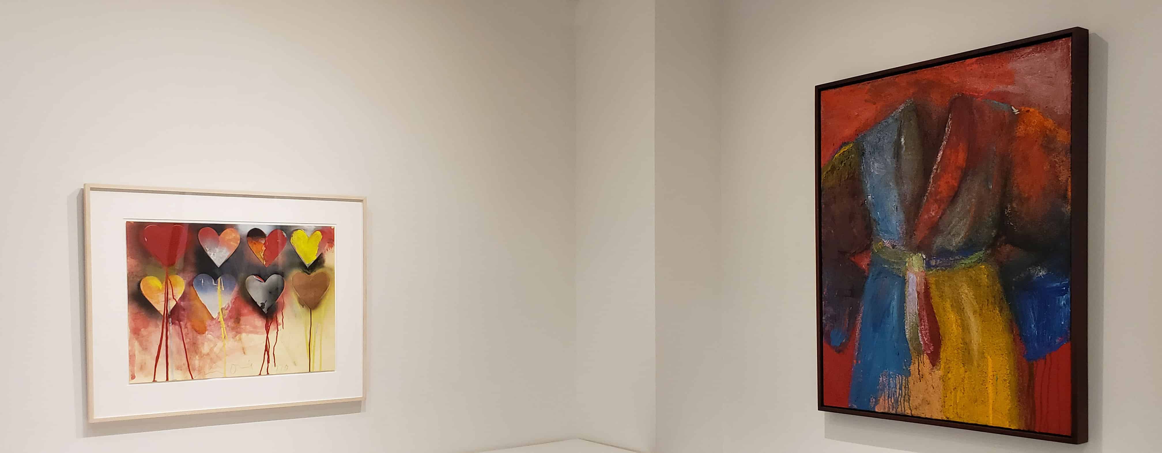
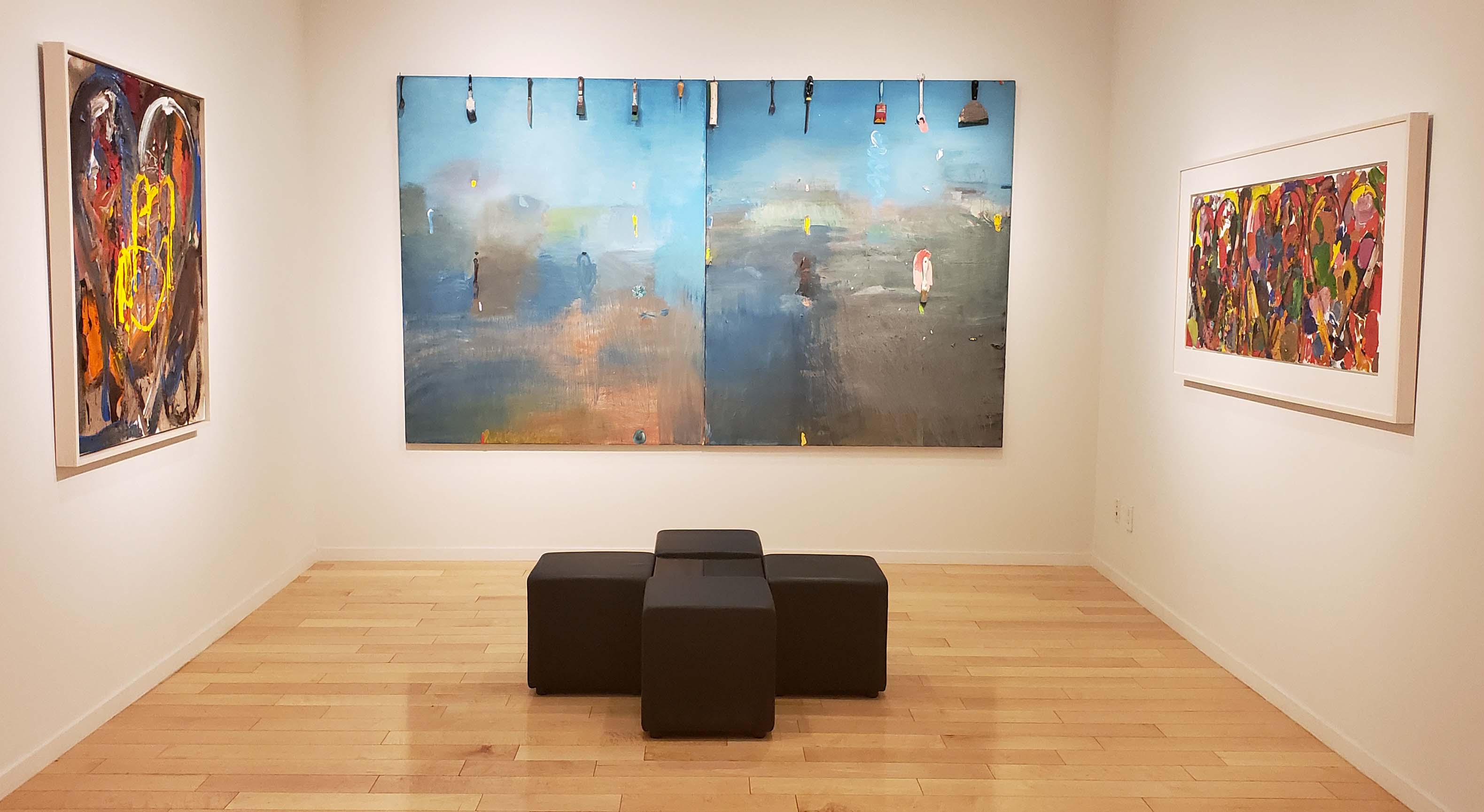
Installation Views
Click on the image to enlarge


Jim Dine Exhibition
Commentary by John Yau
Jonathan Novak Contemporary Art, which has represented Jim Dine for nearly twenty years, has brought together a retrospective of the artist’s work spanning fifty years of his remarkable career. Beginning with the large collage-painting on paper, Untitled (Gossip) (1970-71), and ending with the monumental, hand-painted, five-panel woodcut, Asleep with his Tools, Jim Dreams (2018), this Jim Dine exhibition features notable examples of the artist’s well-known motifs: hearts, robes, tools, and the 2nd-century-BCE masterpiece, Venus de Milo, which is in the collection of the Louvre. It also underscores Dine’s capacity to make works that do not fit neatly into art historical categories, such as collage and painting.
An instrumental and innovative artist, Dine has had at least five careers since he and Claes Oldenburg started Judson Gallery in 1959. This endeavor helped move the art world away from Abstract Expressionism and initiated a new era. He was a central figure in authoring, staging, and performing in Happenings, the precursor to Performance Art. He is a poet who writes many of his poems on long sheets of paper tacked to the wall, which is to say he is a poet-performer. He is a painter who began using the motifs of hearts and robes in the mid-1960s, during the rise of Pop Art, though he doesn’t consider himself a Pop artist. He is a draftsman and printmaker whose graphic mastery is beyond dispute. Later in his career, in the early ‘80s, he became a sculptor as well.
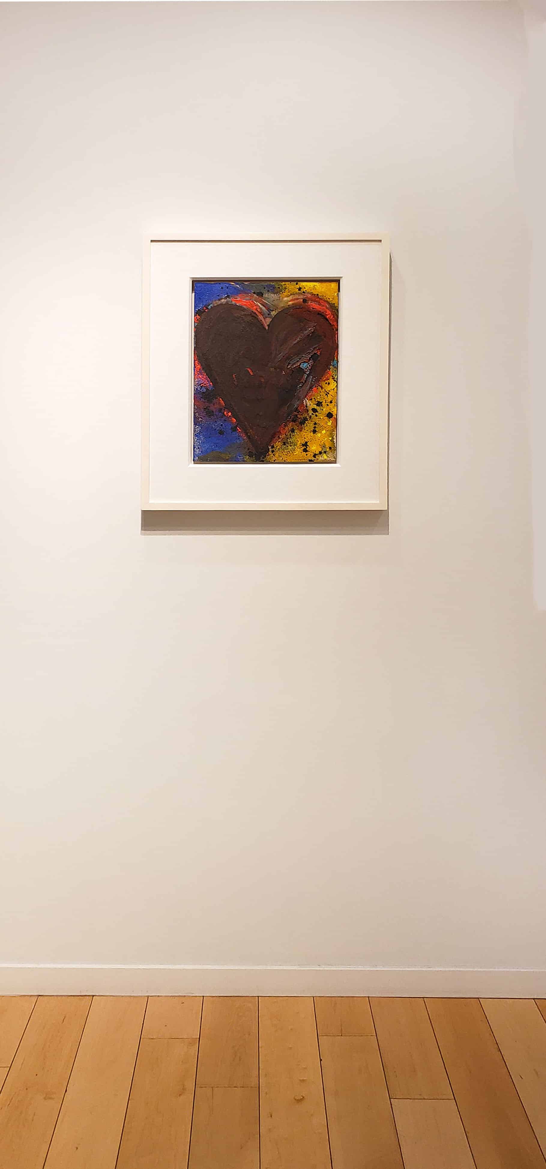
Dine uses his motifs as a springboard for plunging into an array of mediums, exploring how far he can take them without losing their essential features. The heart is certainly a motif we become familiar with in our childhood, when we give and receive our first valentines. This is the challenge Dine gave himself early in his career: could he make this familiar image new each time he explored it? At the same time, a gifted draftsman, whose line and touch are unrivaled by anyone in his generation, Dine recognizes that there are always limits, no matter how talented or defiant you are.
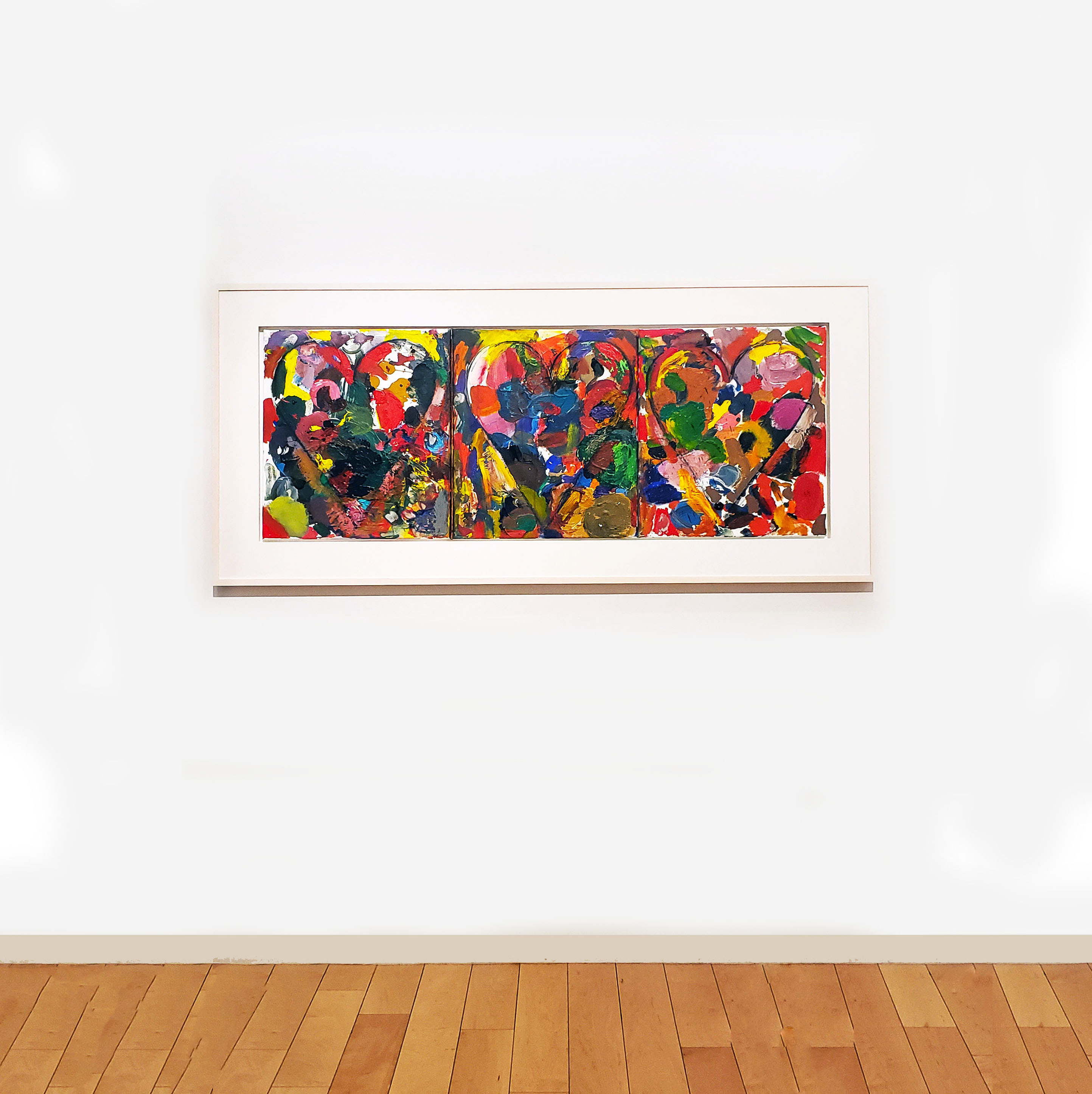
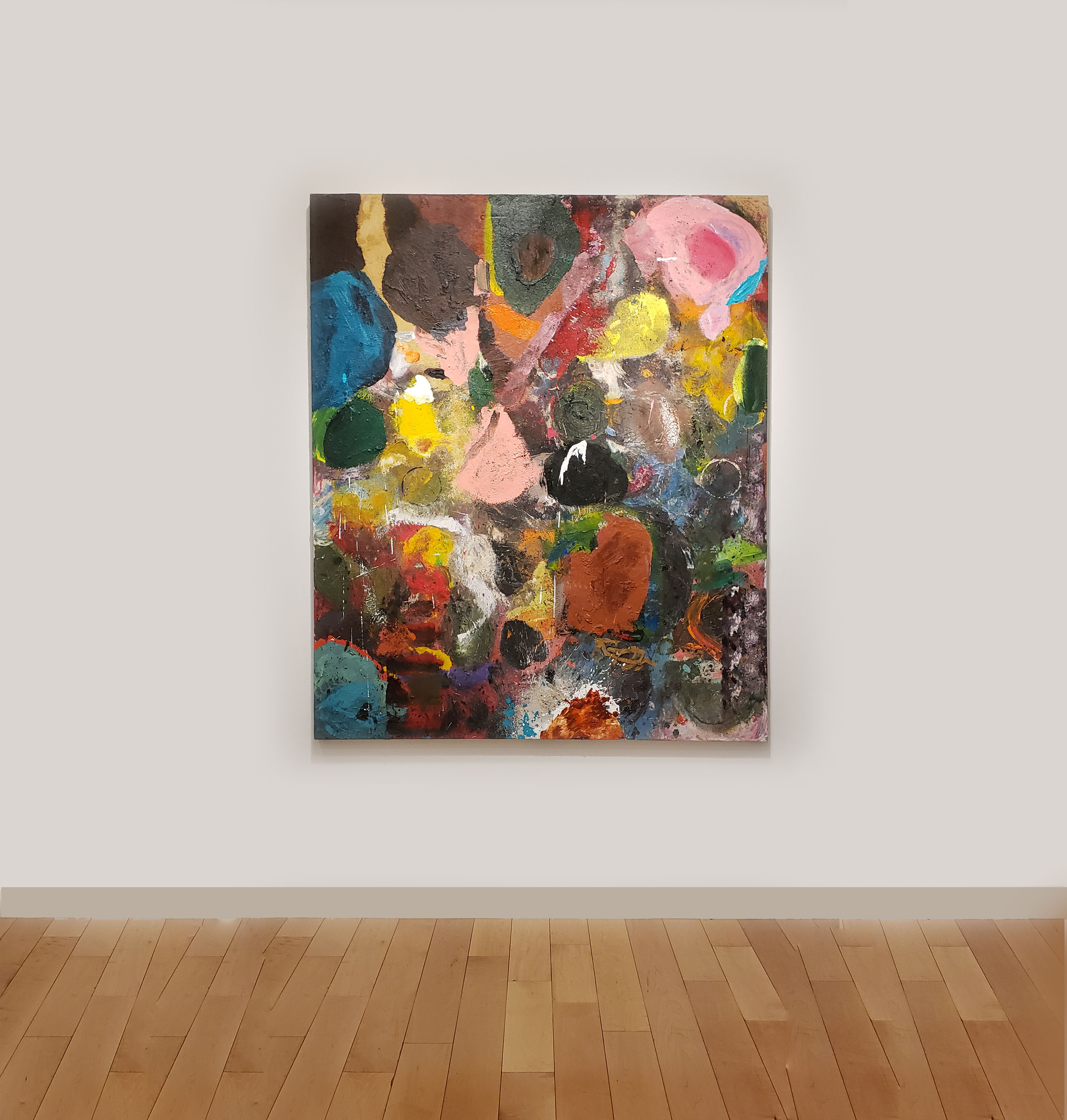
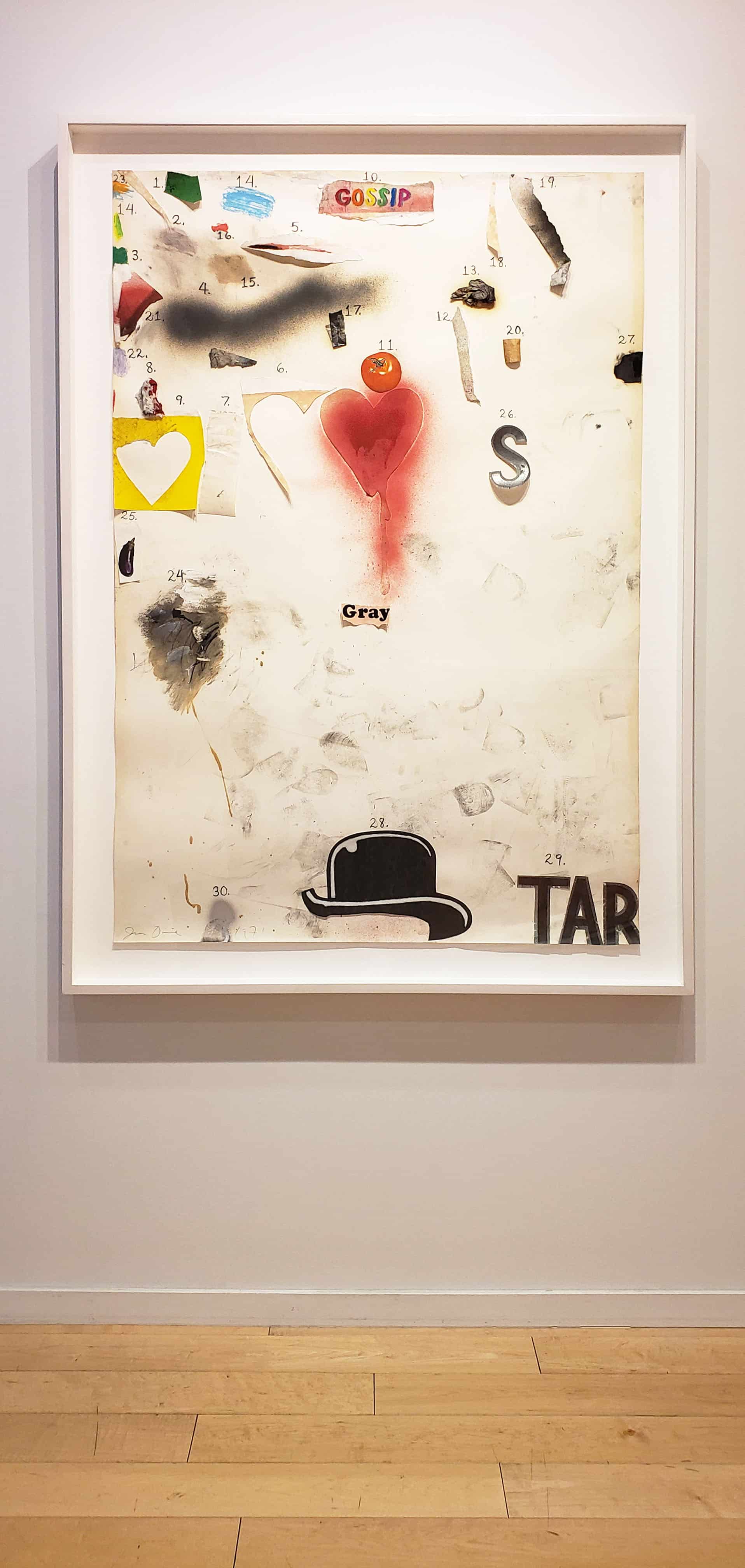
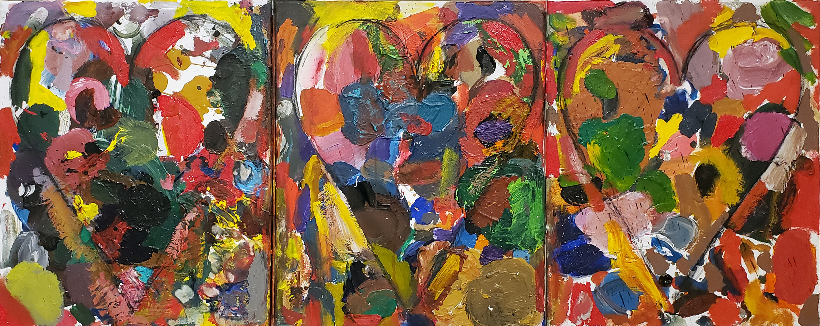
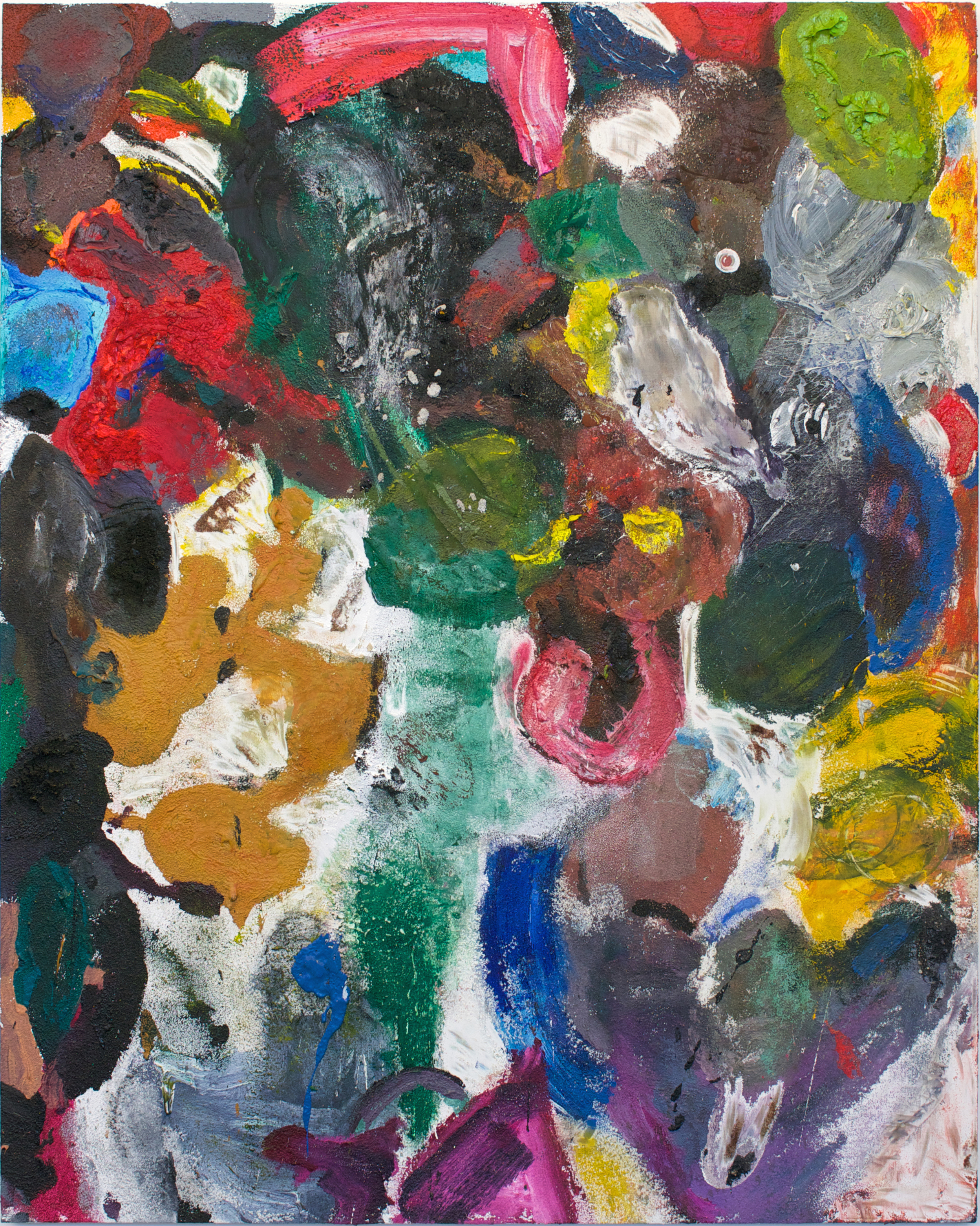
Jim Dine Untitled (Gossip) 1970-71 Paint, spray paint, charcoal, paper elements, oil pastel, magazine reproductions, and pencil on paper 60″ x 40″ (152.4 x 101.6 cm)
When we look at what Dine did with his heart motif in Untitled (Gossip) (1970-71) and Putney Winter Heart #6 (B.B. King) (1972), we get a sense of how innovative and open he was to experiment at a time when many of his peers had settled into a signature style. The other thing that distinguishes his work is his use of language and sense of playfulness.
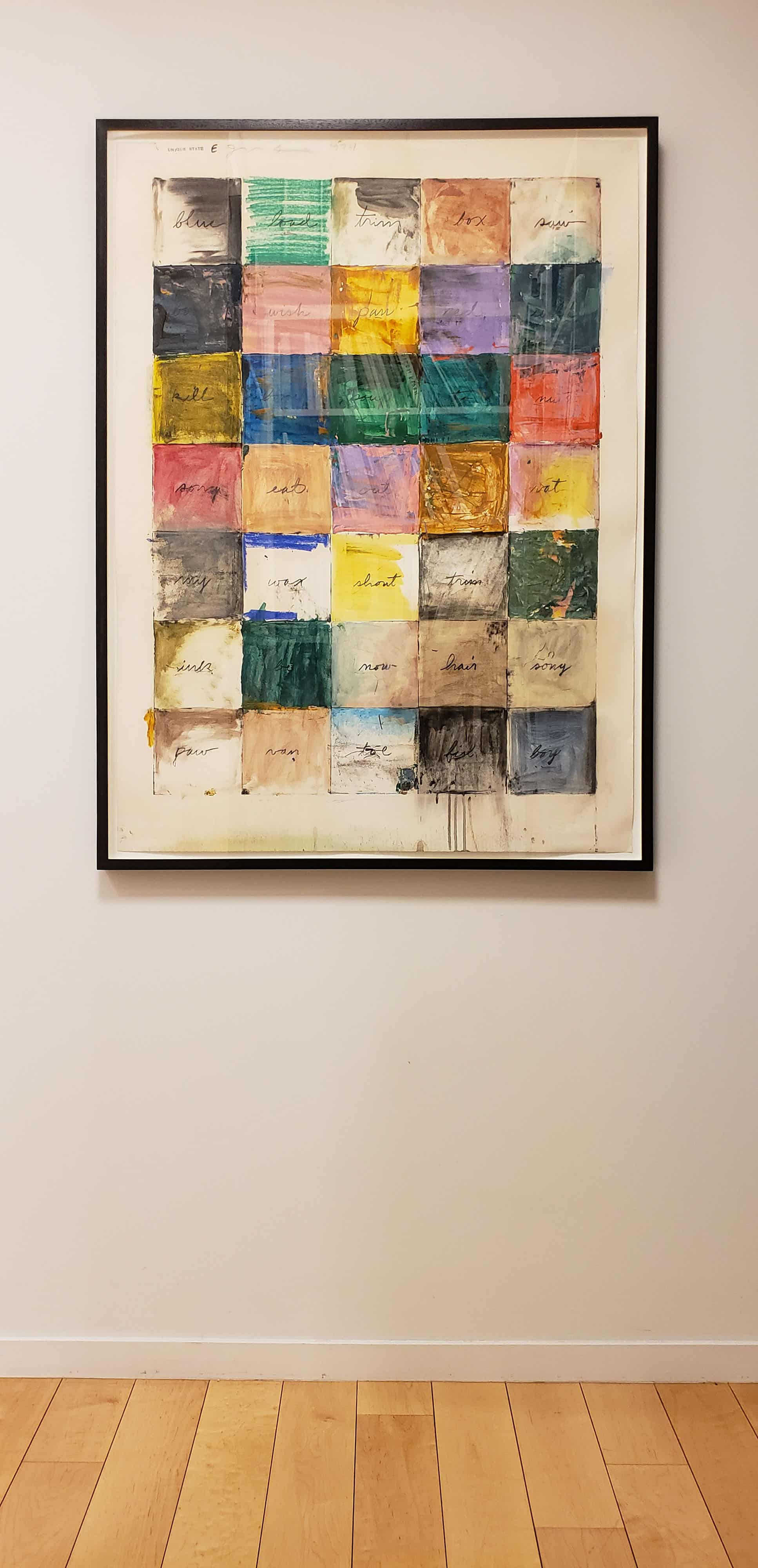
In 1967, when Dine first went to England, he met the English poet-printers Asa Benveniste and Tom Raworth. By this time, he had already met the American poets Ron Padgett, Robert Creeley, and Ted Berrgian, and was writing poetry every day. Benveniste, through his imprint, Trigram Press, published Dine’s first poetry book, Welcome Home Lovebirds, in 1969.
Untitled (Gossip) (1970-71) is a work on paper that Dine made while he was living in London. This is reflected in the image of the bowler hat near the middle of the bottom edge, while word “GOSSIP,” printed on a torn piece of paper directly above the bowler hat, affixed near the top edge. Between the word “GOSSIP” and the image of the bowler hat is a cut-out red heart and the illustration of a bright red apple. The heart has been painted red and red spray paint drips down from its lower right side.
Untitled (Gossip) is brimming with questions. Why is the heart “bleeding? Are we supposed to connect the numbers or is this a way of keeping track of all the things the artist has done to the surface. What about the footprints in the lower half, below the heart and above the bowler hat? They are not numbered. What are we to make of them? Don’t the footprints and numbered marks and bits of collage echo the word “gossip,” which is about the circulation of details about a person that are not necessarily true?
By encouraging viewers of this Jim Dine Exhibition to follow the numbers to see if any connection between them can be discerned, Untitled (Gossip) invites us to complete the piece.
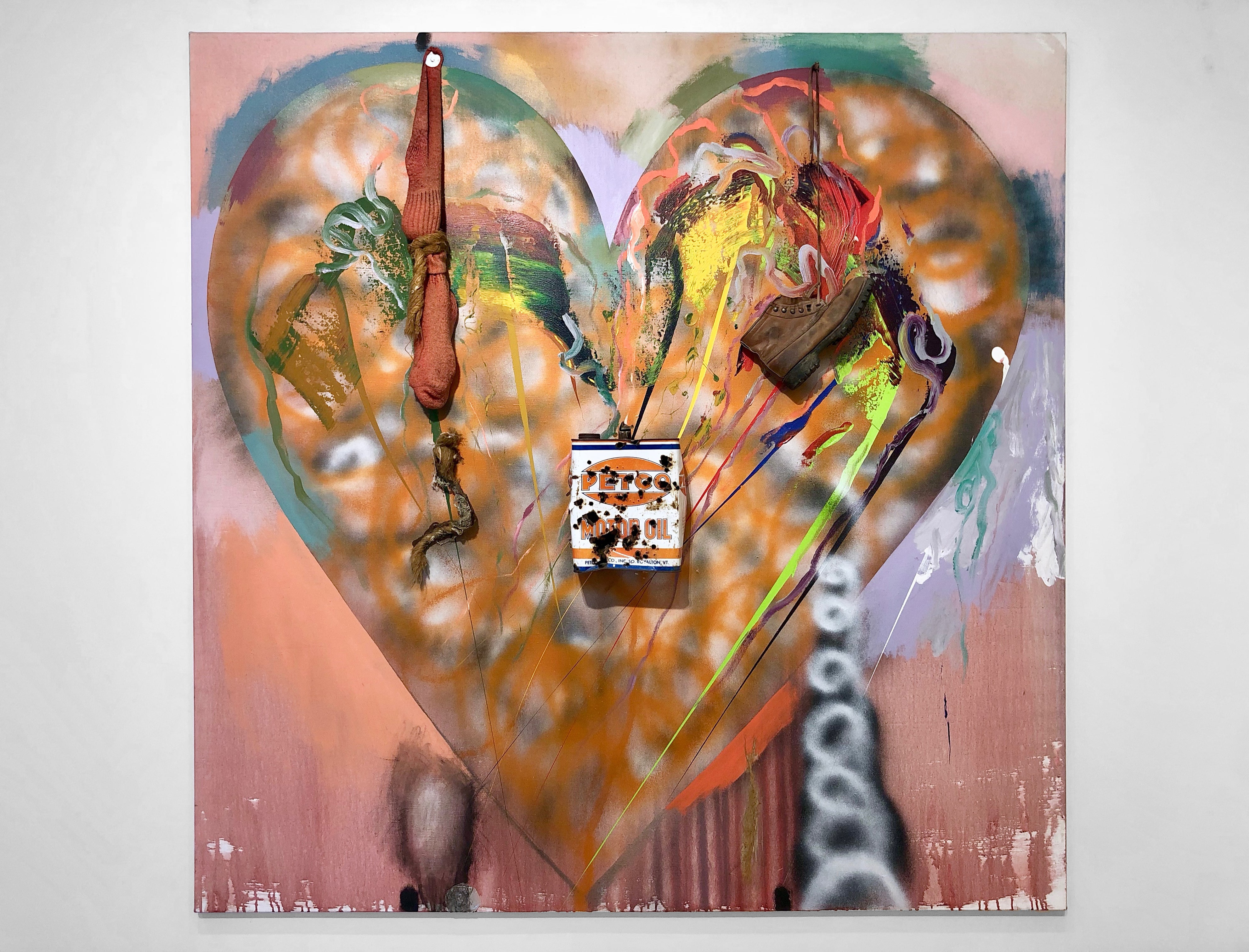
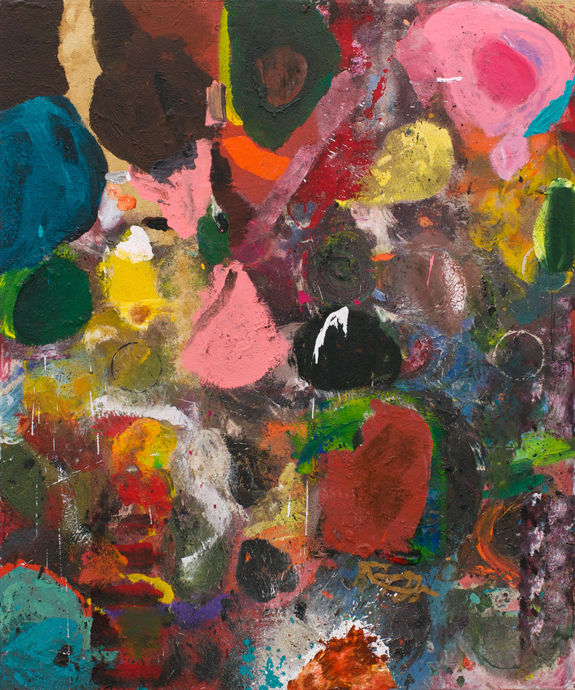
Jim Dine Putney Winter Heart (P.W.H.) #6 1971-72 Oil and spray acrylic on canvas with metal, rope, boot, sock and aluminum 72-1/8″ x 72-1/8″ x 9″ (183 x 183 x 18 cm)
In Putney Winter Heart #6 (B.B. King) (1972), Dine expands the idea of collage by pulling out all the stops. He paints a giant heart icon in oil and spray acrylic and attaches a boot, a sock, and a can of motor oil to the canvas. The can is affixed to the middle of the heart, while the sock and the boot, strung up by its laces, are attached to the top of the heart’s rounded left and right halves, creating a triangular constellation.
One could say that the familiarity of the heart icon allows Dine to do whatever he wants to the painting, to disrupt the surface with seemingly random objects and incongruous applications of paint.
The paint varies from thin and watery along the bottom edge to thick, palpable brushstrokes near the top of the heart. There is also a coiled, porous, spray-painted line climbing up from the canvas’s lower depths and piercing the middle of the heart’s right side.
By making the heart the dominant shape, Dine seems to be asking how much a familiar form can be disrupted before it loses its coherence? How much can a painting absorb from the world around it and still be recognizable as a painting?
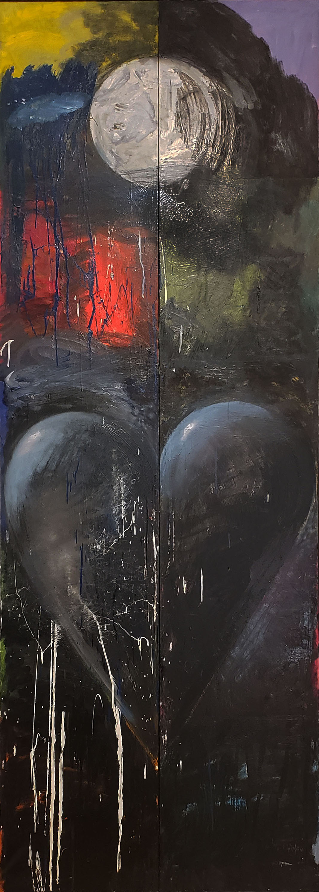
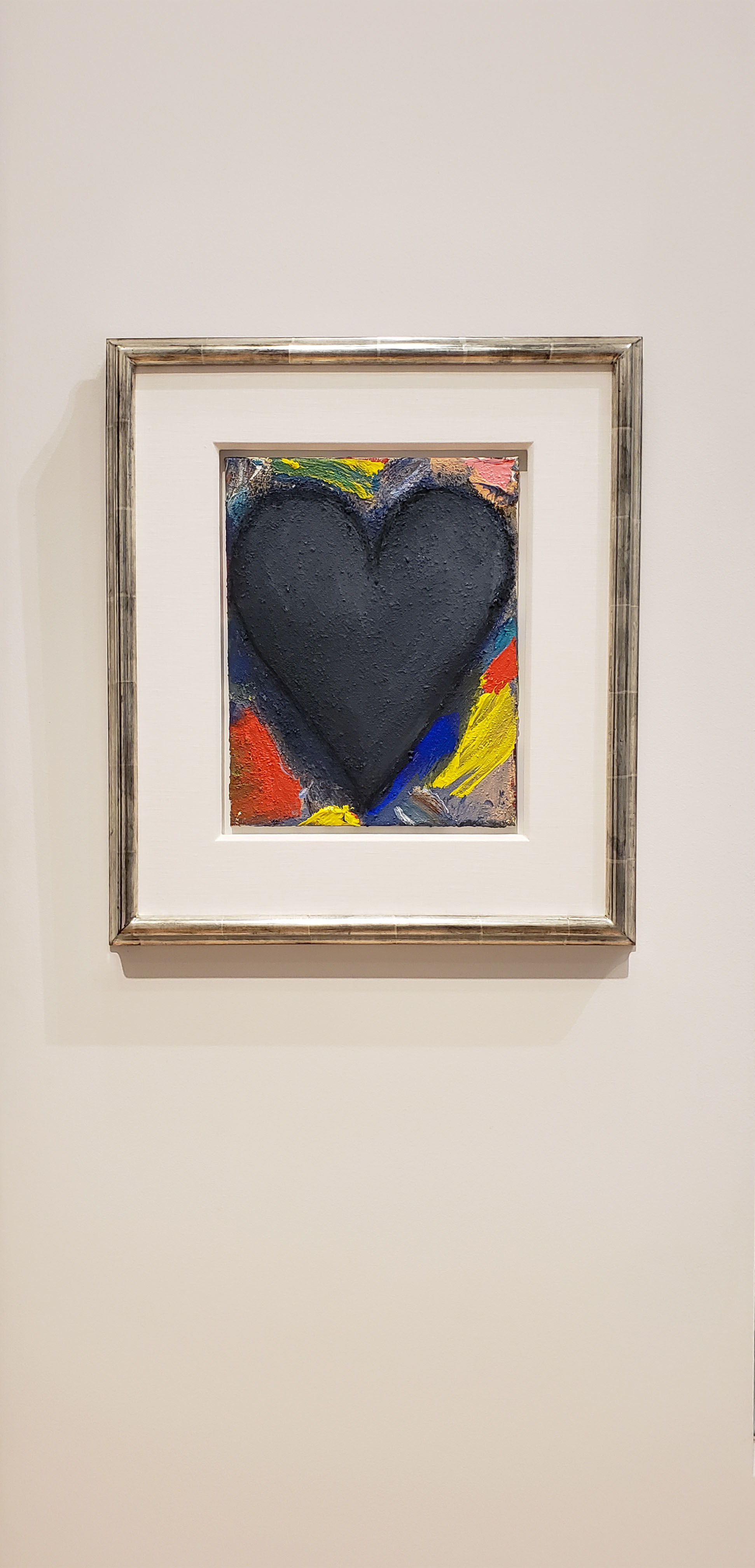
Jim Dine Sleeping Alone/Apart from the Moon, 1993 Oil, enamel and charcoal on canvas 112″ x 40″ (284.5 x 106.7 cm)
In the tall, vertical painting, Sleeping Alone/Apart from the Moon (1993), which is made of two equally sized panels joined together, Dine depicts a large volumetric heart, which fills much of the painting’s lower half, suspended against a loosely painted, largely black ground. Green, blue, and red underpainting peeks through along either side of the heart. The top of the heart’s rounded halves is accented by gray-blue, as if reflecting the moonlight. There are a few thin white rivulets of paint running over and down from the heart.
Directly above the heart, near the painting’s top edge, we see a full white moon, with loosely painted passages of red, yellow, and blue, while in the right panel we see passage of black, green, and violet. As with Untitled (Gossip), the autobiographical current running through Dine’s work never becomes a narrative.
Inspired by the Abstract Expressionists, he wants the viewer to see Sleeping Alone/Apart from the Moon as a painting rather than as a story. At the same time, Dine’s wife’s name is Diana, which is the name the Romans gave to the goddess of the moon. For Dine, paint is paint and something capable of conveying of deep feeling.
Jim Dine Swimming in the French Sea 2015 Acrylic, sand and charcoal on canvas 24″ x 60-1/4″ (61 x 153 cm)
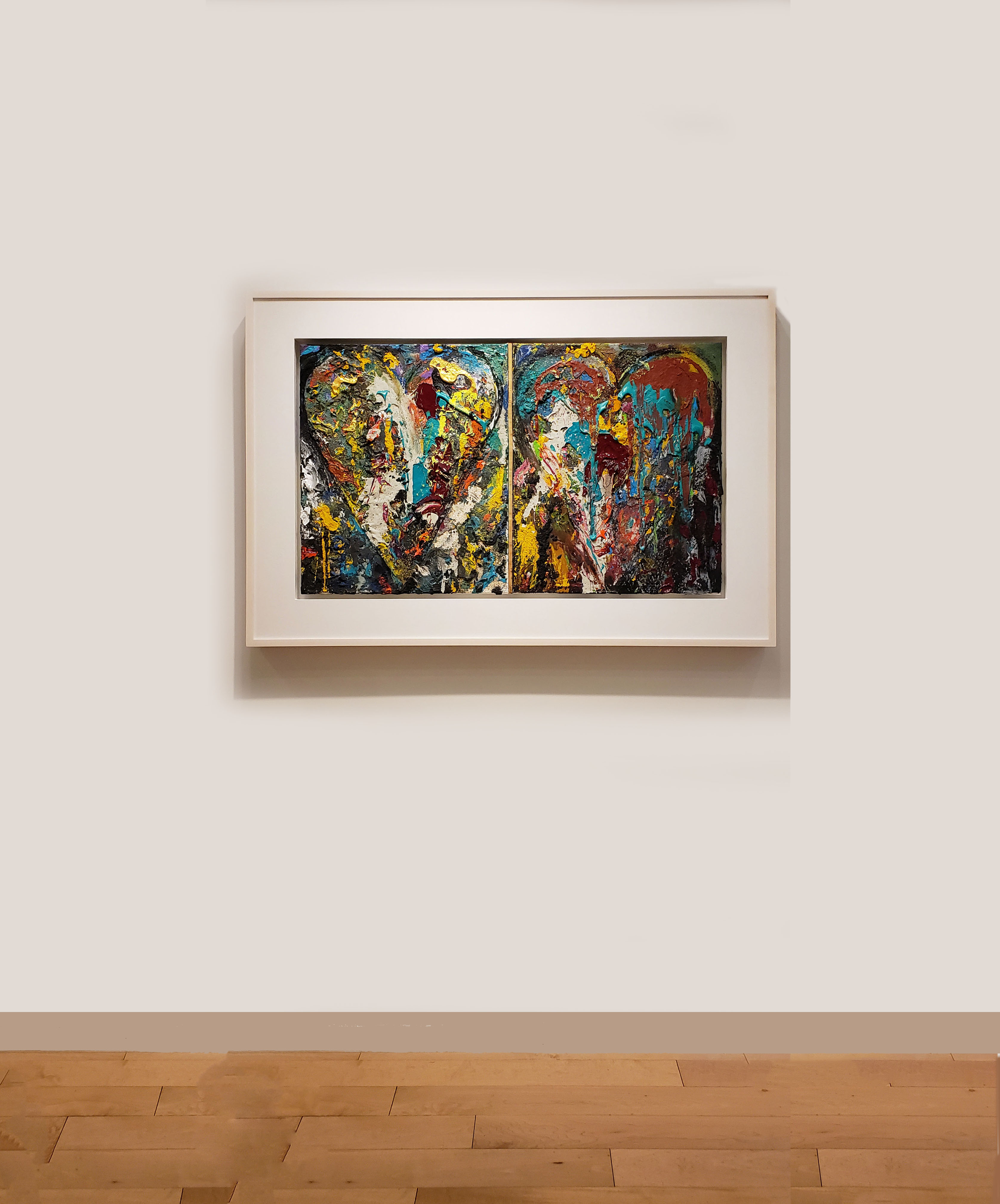
In the three-panel painting, Swimming in the French Sea (2015), which was created more than forty years after Putney Winter Heart #6 (B.B. King) and Untitled (Gossip), and nearly twenty years after Sleeping Alone/Apart from the Moon, we see a very different exploration of the heart motif. In this work, Dine uses acrylic, sand, and charcoal to paint, encrust parts of the surface, and draw the heart’s contour.
The heart’s outline defines what is inside and outside its border, which the paint and built up areas challenge, suggesting a constant struggle to maintain one’s boundaries while remaining open to the world around it. At the same time, each heart exists on the cusp between form and all-over abstraction. Despite the similarity of their compositions, each panel is injected with a very different feeling and mood.
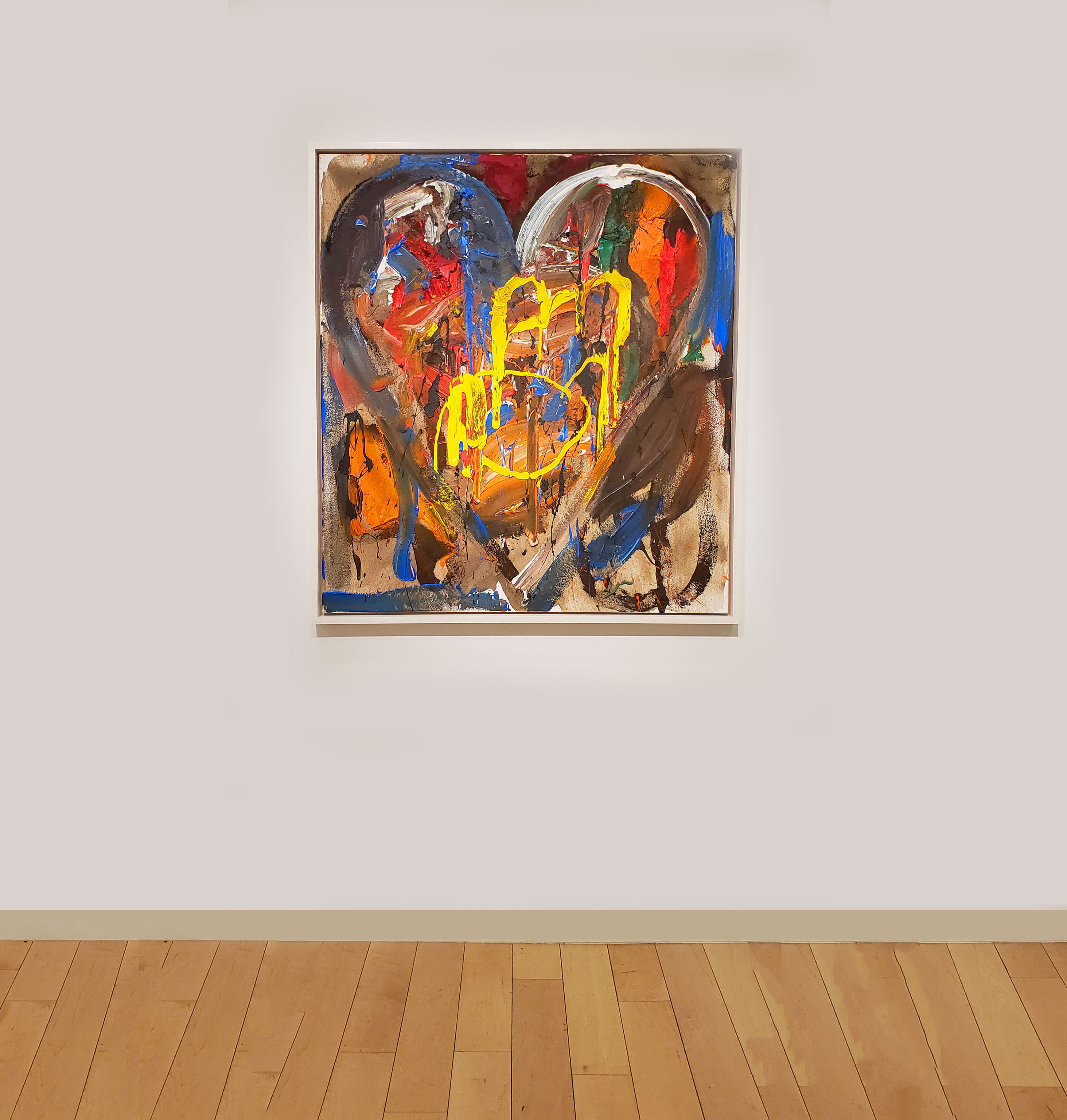
Jim Dine Miner’s Lite 2006 Oil, acrylic, sand and charcoal on linen 48-1/4″ x 96-1/4″ (122.5 x 244.5 cm)
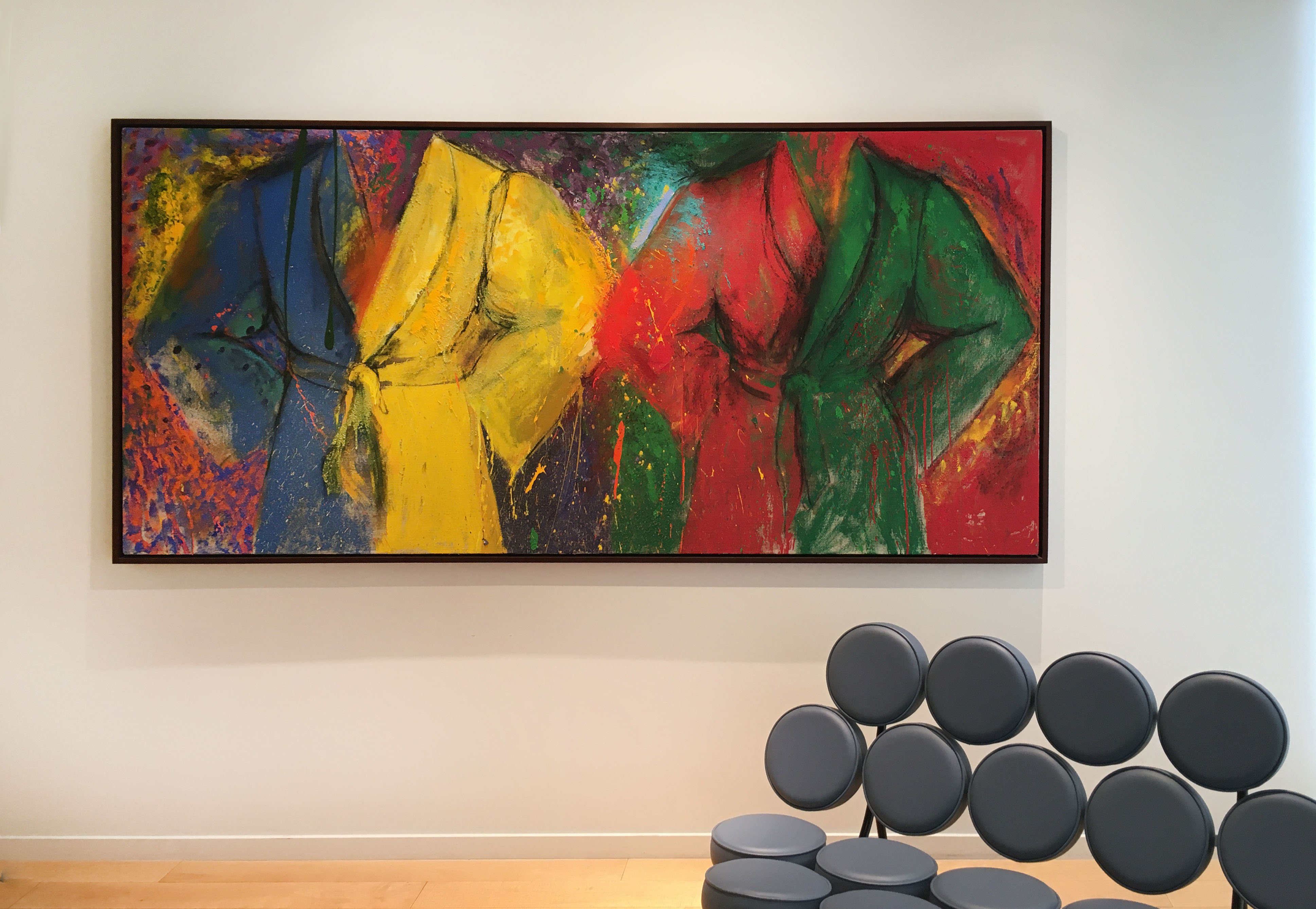
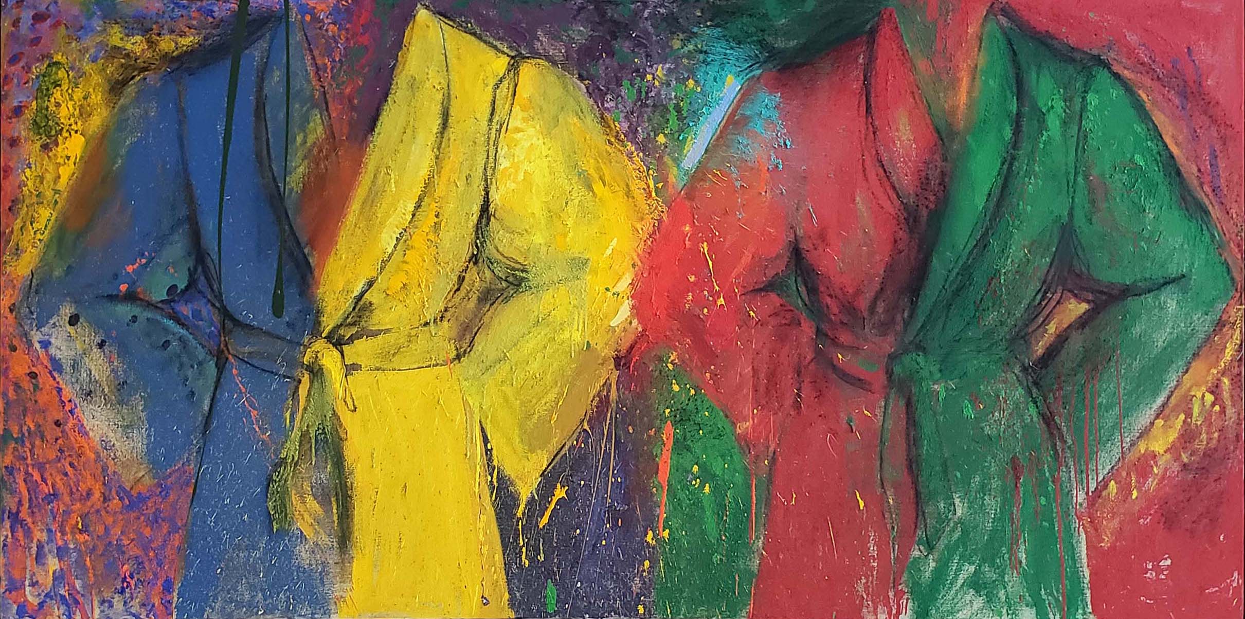
As with heart motif, there is – as previously stated – an autobiographical current running through his motif of the robe. This is what Dine said about the genesis of the robe as a self-portrait to John Gruen (ARTnews, September 1977) :
“What I use is what I’ve used from the very beginning—a newspaper ad which I clipped out of The New York Times back in 1963. The ad shows a robe with the man airbrushed out of it. Well, it somehow looked like me, and I thought I’d make that a symbol for me. Actually, it all began when I wanted to paint a self-portrait . . . and just couldn’t. It’s important for me to say this, because what I really wanted to do was sit in front of a mirror and paint a portrait of myself. But at the time, I was in analysis and the pressures I felt prevented me from going through with it.”

Jim Dine The Passion of Late Winter 2006 Triptych: Oil, acrylic, sand and charcoal on canvas Each canvas: 60″ x 48″ x 1-1/2″ (152.4 x 121.9 x 3.8 cm) Overall: 60″ x 144″ (152.4 x 365.8 cm)
In the robe paintings, the motif becomes a structure that is both challenged and preserved, which echoes the individual’s relation to the self. Each section of the robe – the sleeves, sash, and lapels – is a distinct abstract shape (or, in the case of the sash, a linear element) that Dine can explore. Simultaneously playful and serious, Dine seems to be testing how far he can go towards inviting illegibility (or chaos) without ever attaining it. Doesn’t this become a testament to the individual capacity for endurance and survival? While the shapes of the robes are clear-cut in Miner’s Lite, they all but dissolve into the multicolored ground in the triptych, The Passion of Late Winter (both from 2006).
In contrast to other artists of his generation who were connected with Pop Art, Dine wanted to keep the vigor of the brushstroke and the handmade in play. This interest in what the hand can do has deep roots in his childhood in Cincinnati, Ohio, where his family owned a hardware store.
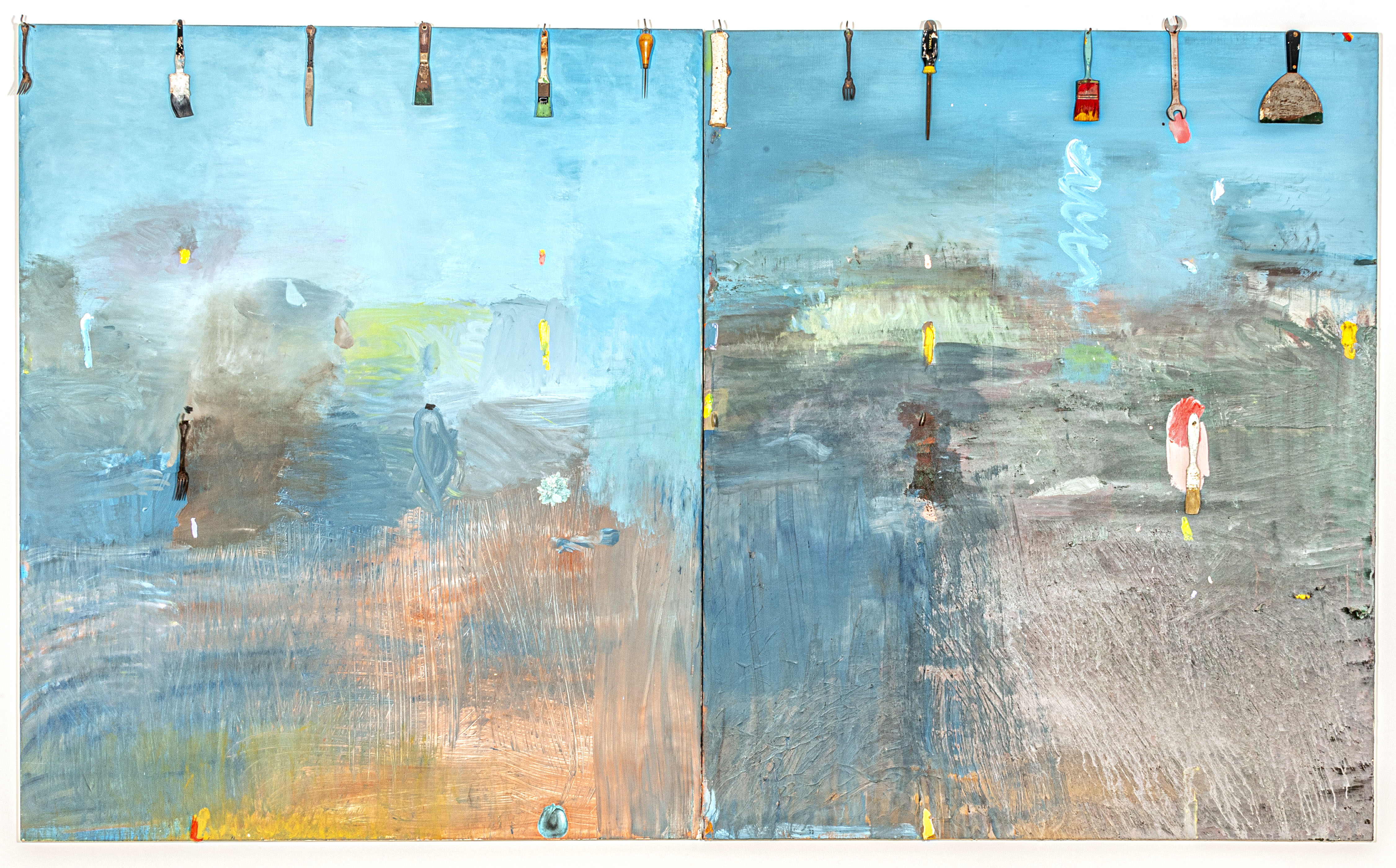
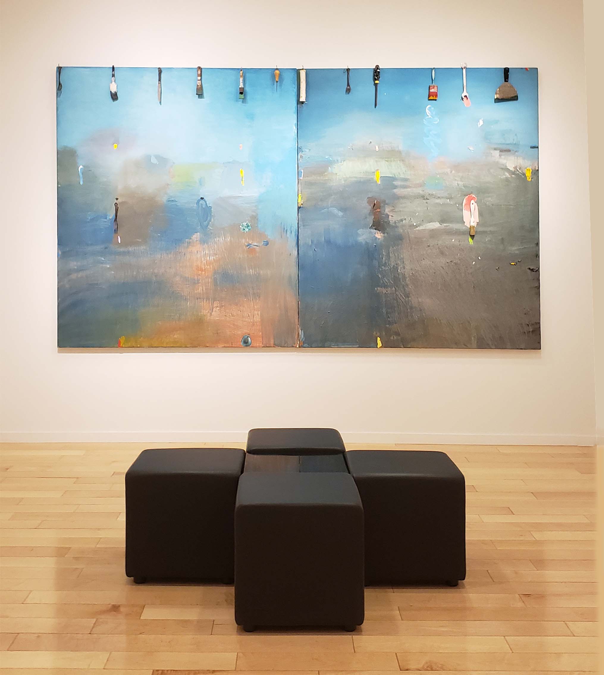
Jim Dine Harry Mathews Skis the Vercour 1973 Diptych: Acrylic, collage and mixed media on canvas Each canvas: 72″ x 60″ (182.9 x 152.4 cm) Overall: 72″ x 120″ (182.9 x 304.8 cm)
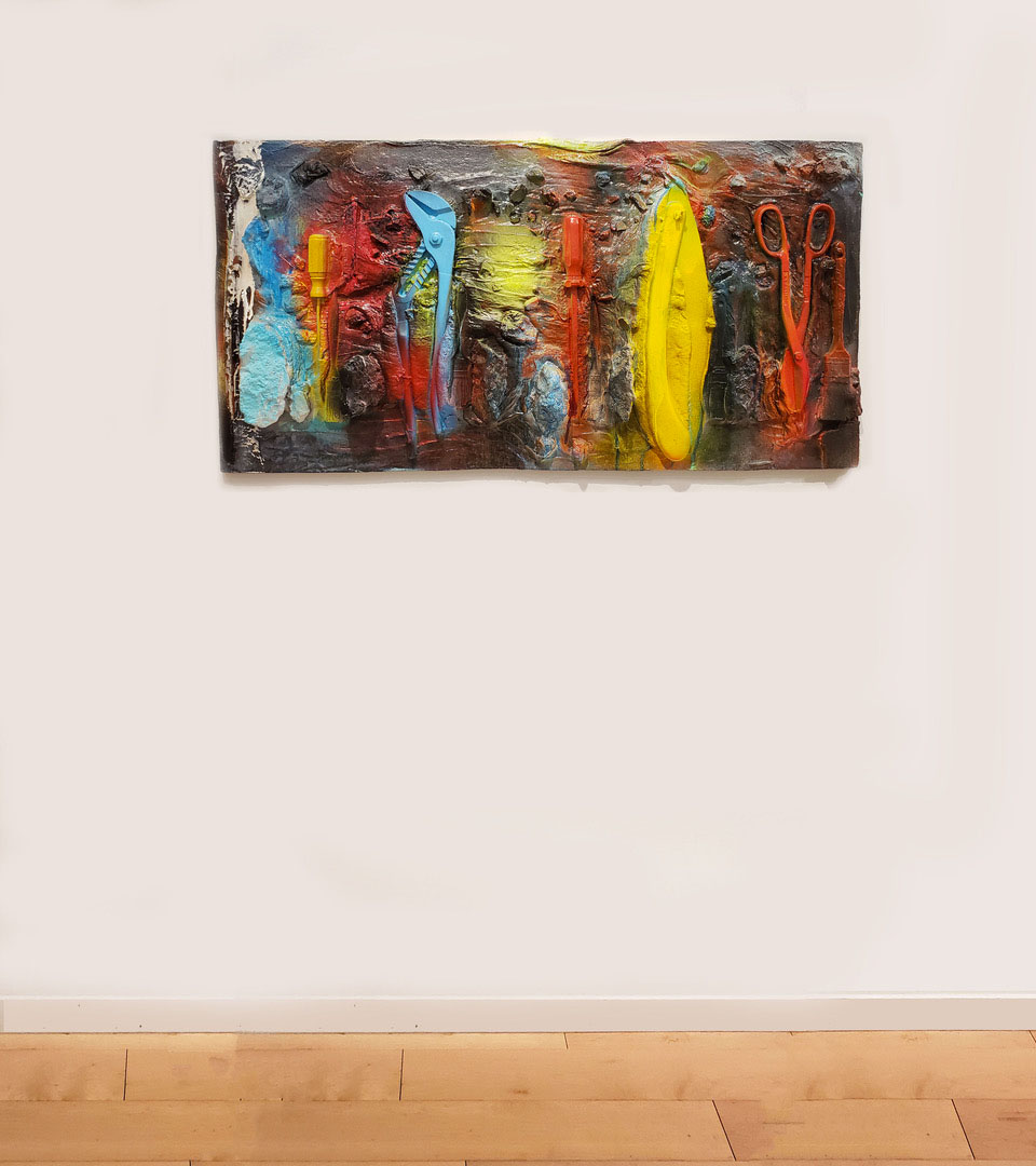
In the diptych, Harry Mathews Skis the Vercour (1973), Dine paints two abstract landscapes dominated by different intensities of blue. Along the top edge of both panels he has attached a series of tools, spaced more or less evenly apart. The tools include used paintbrushes, suggesting that they played a part in the painting to which they are attached, along with an awl and a screwdriver, among other items.
There is a proverb, “A bad workman blames his tools.” Dine’s painting suggests the opposite: a good workman knows which tools to use. By linking tools to painting, Dine is comparing the artist to the laborer; both use their hands and rely on an assortment of instruments with clearly defined purposes. In Dine’s view, neither the artist nor the laborer is superior to the other.

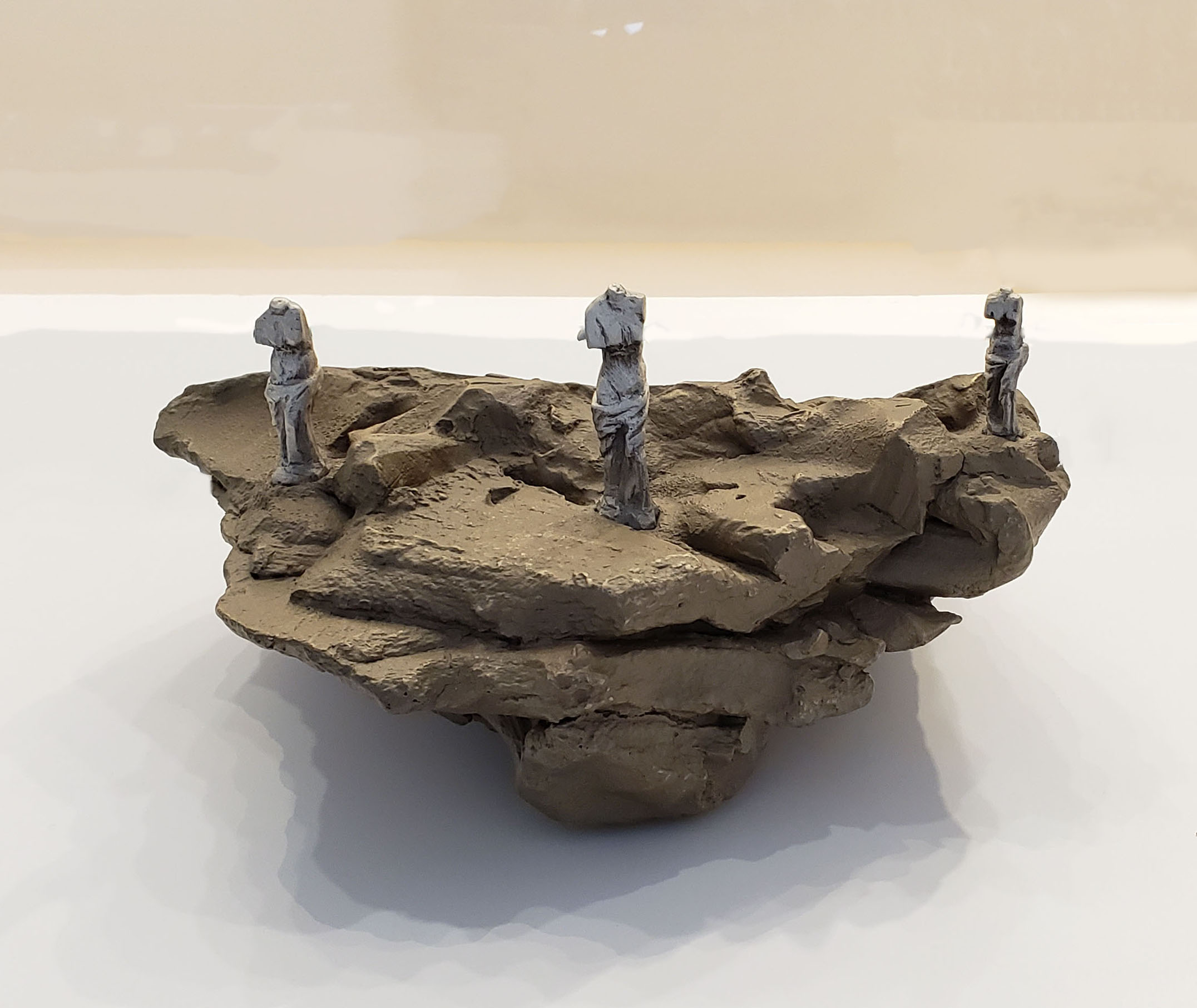
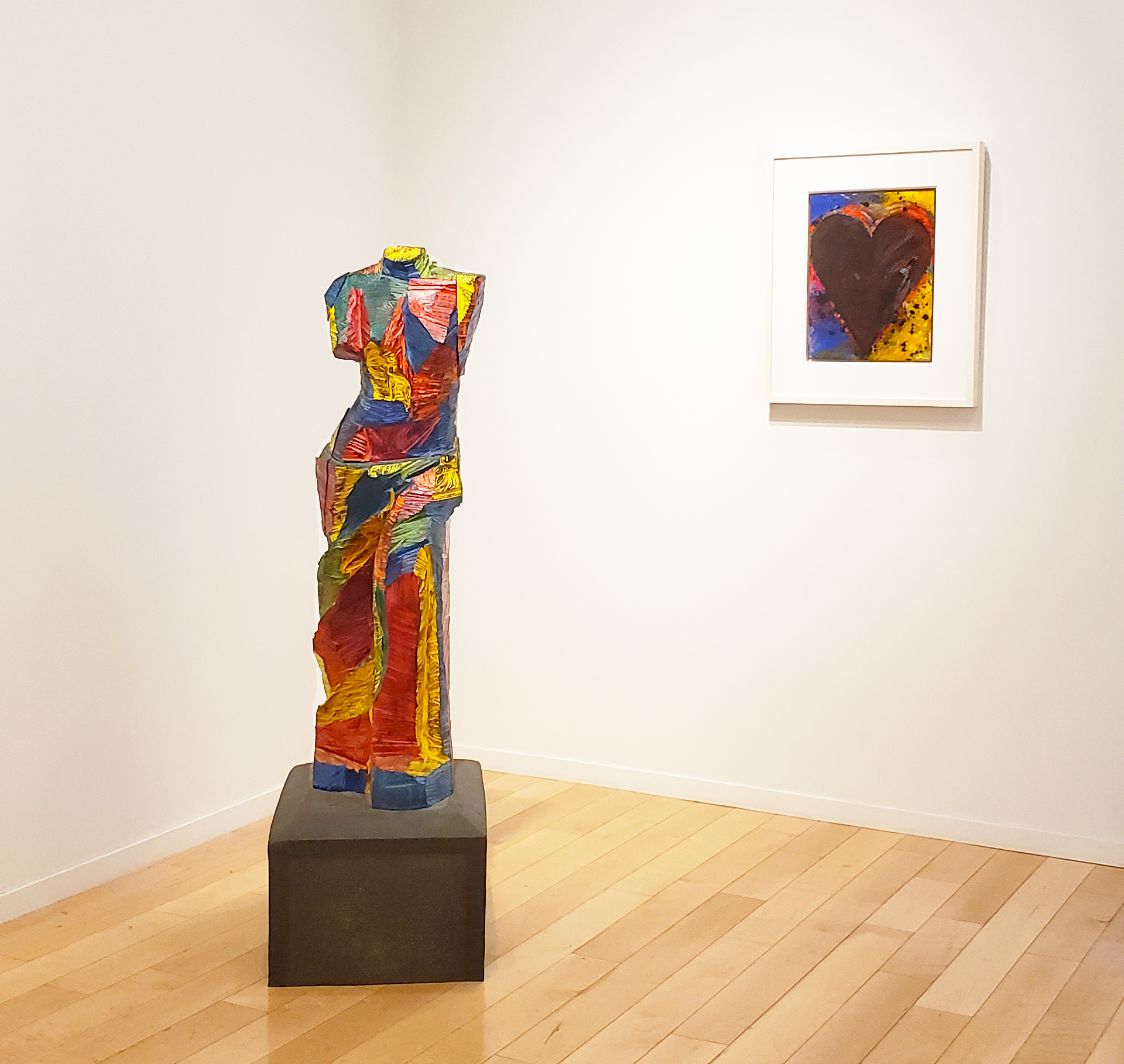
Jim Dine Study for “Looking Toward the Avenue” 1989 Cast silver and bronze 6″ x 12″ x 9-1/2″ (15.2 x 30.5 x 24.1 cm) Edition of 6
In the cast-silver-and-bronze multiple, Study for “Looking Toward the Avenue” (1989), Dine gauges the spacing and position of these three, largely identical sculptures. Given the size of the public version, the intimate scale that Dine originally used to determine the placement of the three figures is a revelation.
In fact, the study more closely echoes the original marble sculpture, while the public version comes across as weathered and damaged. Starting out as a heavily worked form, the bronze casting retains evidence of the artist’s hands. In both the study and the final bronze, Dine has literally and metaphorically reshaped the original. In contrast to Salvador Dali’s satirical take, Venus with Drawers(1936), he has done this without introducing a new element or parodying the original.
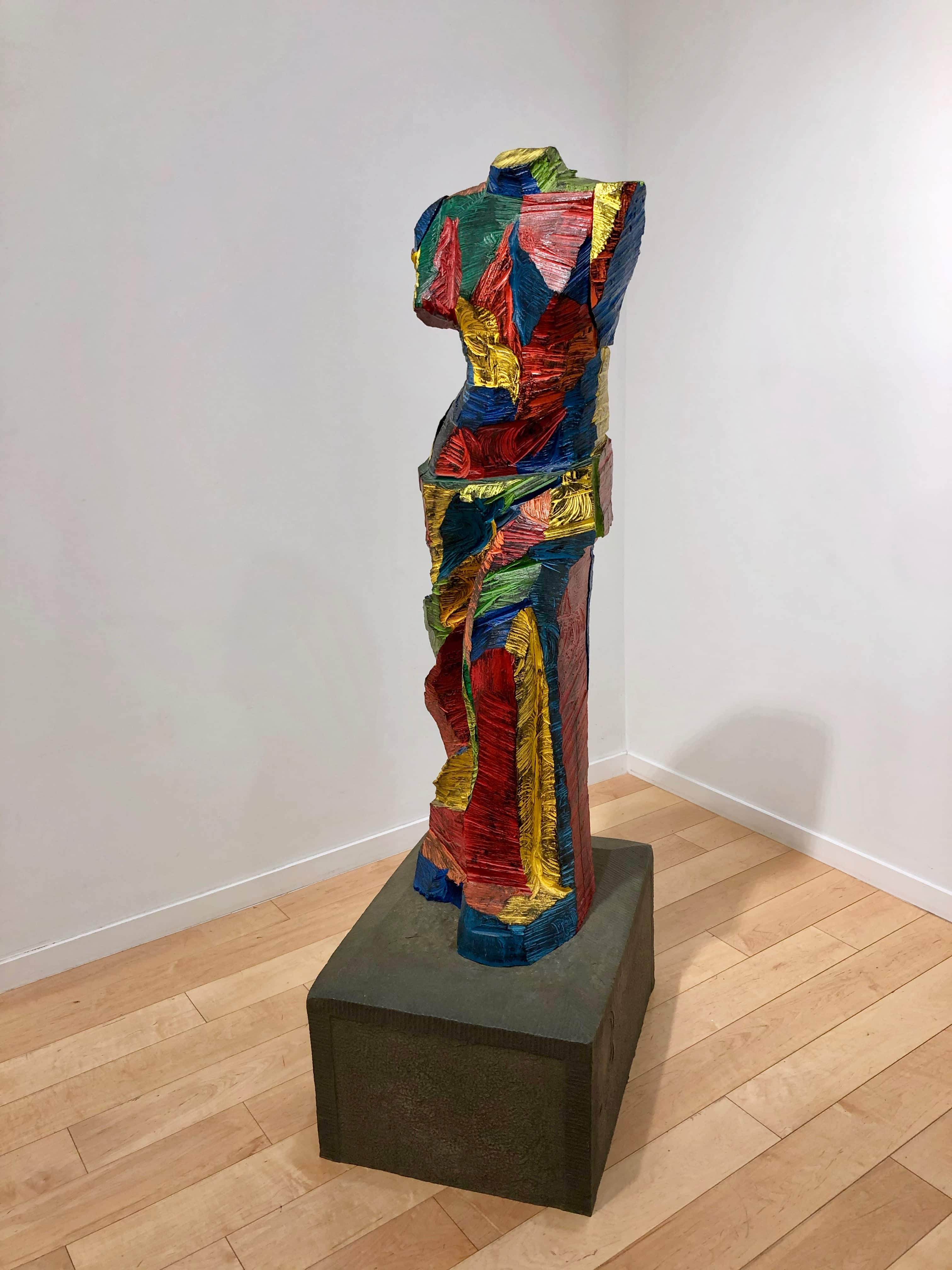
Jim Dine Trembling for Color 1990 Painted bronze 63-1/4″ x 24-3/4″ x 18-1/4″ (160.7 x 46.4 x 62.9 cm)
The following year, with the life-size bronze, Trembling for Color (1990), Dine returns to Venus de Milo and once again allows us to experience a famous form as something new and fresh — the sculpture’s flawless white marble body turned into a scratched and gouged, brightly painted object.
Jim Dine Shadows Introduce Tools to Each Other 2014 Acrylic, sand and charcoal on canvas 60″ x 48″ (152.4 x 121.9 cm)
Jim Dine Tear Up the Screams 2014 Acrylic, sand and charcoal on canvas 72″ x 60″ (182.9 x 152.4 cm)
Long known for working with figurative motifs, Dine broke the mold once again in paintings such as Tear Up the Screams and Shadows/Introduce Tools to Each Other (both dated 2014). Using acrylic, sand, and charcoal—essentially paint and grit–Dine does something completely unexpected in the second decade of the 21st century: he makes an abstract painting that does not look like anyone else’s nor does he parody, imitate, or cite another artist’s work. Sincerity, he tells us through his work, is still possible. By synthesizing cheerful colors with an uneven, scarred, and granular surface, Dine conveys an unnamable tension.
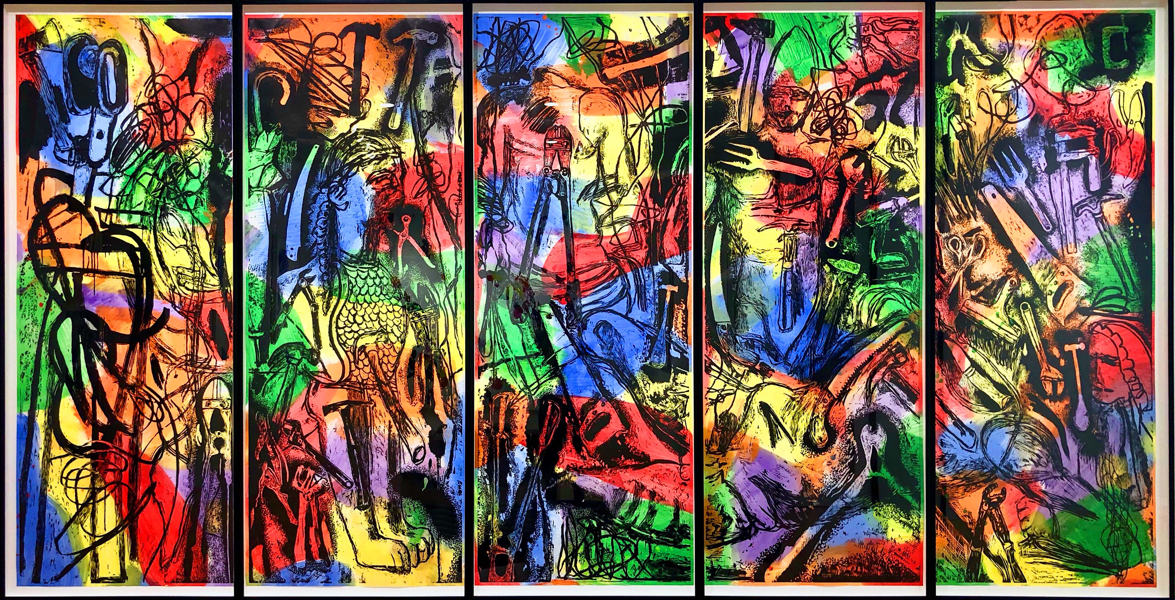
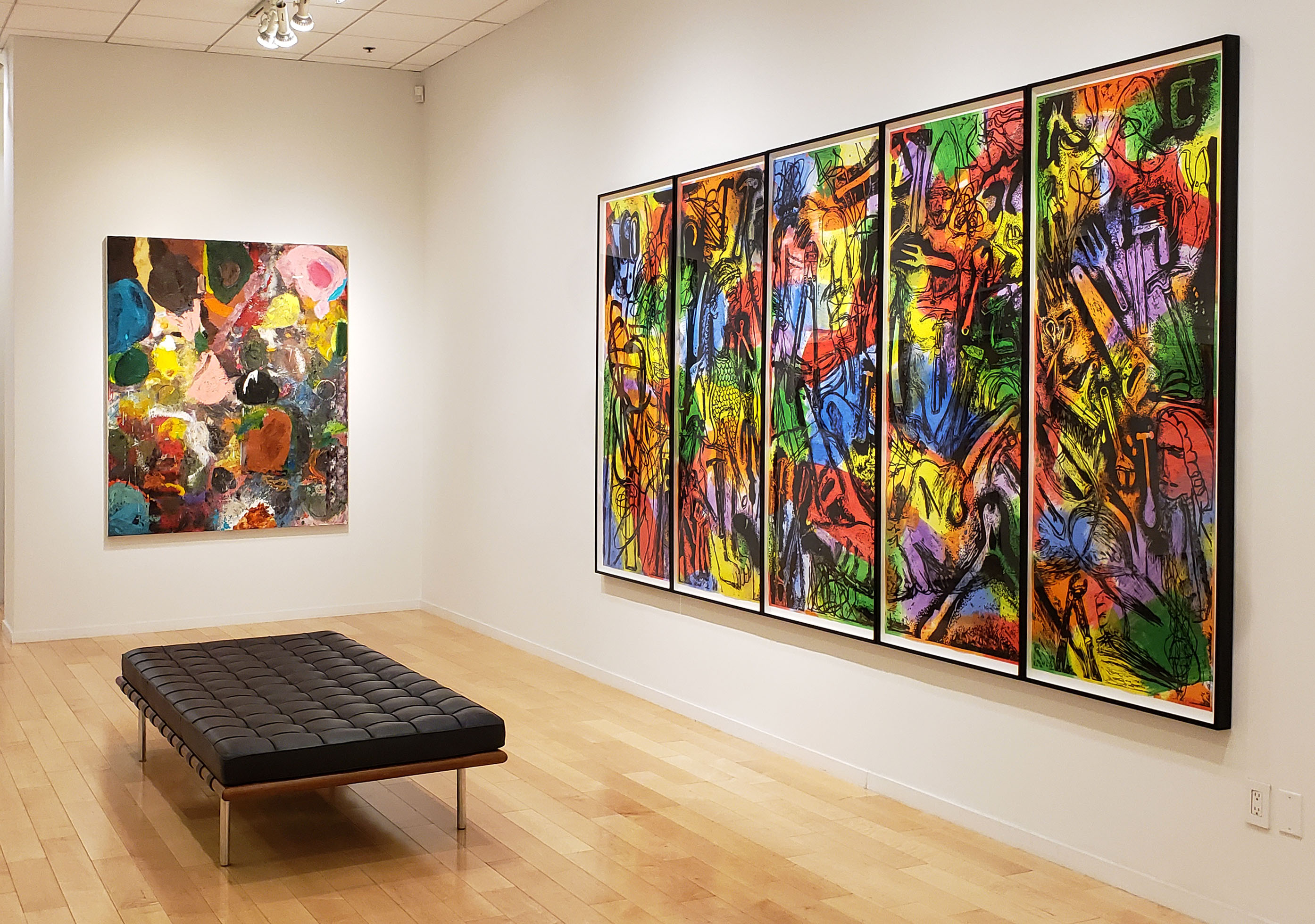
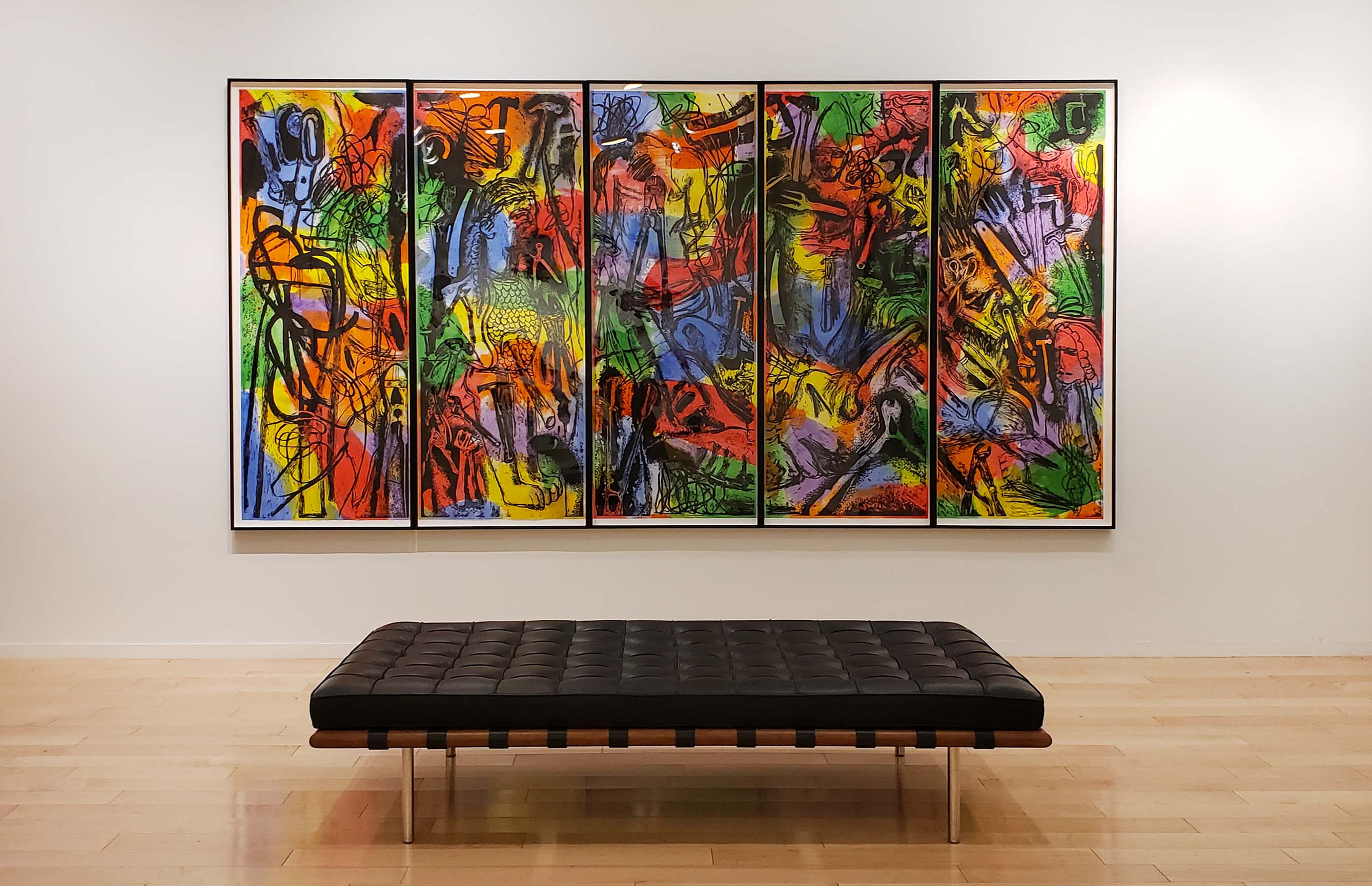
Jim Dine Asleep with his Tools, Jim Dreams 2018 Woodcut in black with extensive hand painting on five sheets of paper
Overall: 72-3/4″ x 139-3/4″ (185 x 355 cm) Each sheet: 72-3/4″ x 28″ (185 x 71 cm) Edition of 7 (+ 2 AP)
The recent five-part, one color woodcut, Asleep with his Tools, Jim Dreams (2018), is one of Dine’s great achievements. Working with a variety of woodcutting tools while incorporating their images into the composition, he uses the woodcutting process to praise these instruments of labor. He then goes one step further and paints each sheet in semi-transparent colors, evoking comparison with the leaded forms seen in a stained glass window.
In this fantastical print, the viewer sees again how ambitious Dine remains as an artist. Each of the five sheets of paper is a shade over six feet tall and a little more than two feet wide. Each sheet is packed with distinct linear elements depicting tools and figures, a dreamscape where anything can be found next to anything else. By hand-painting each set of woodcuts, he makes each of them unique.
Dine is an essential and essentially American artist. Through his paintings, sculptures, collages, drawings, and prints, he praises basic hand-held tools and honest labor, while using his own hands to lay bare his deepest feelings.