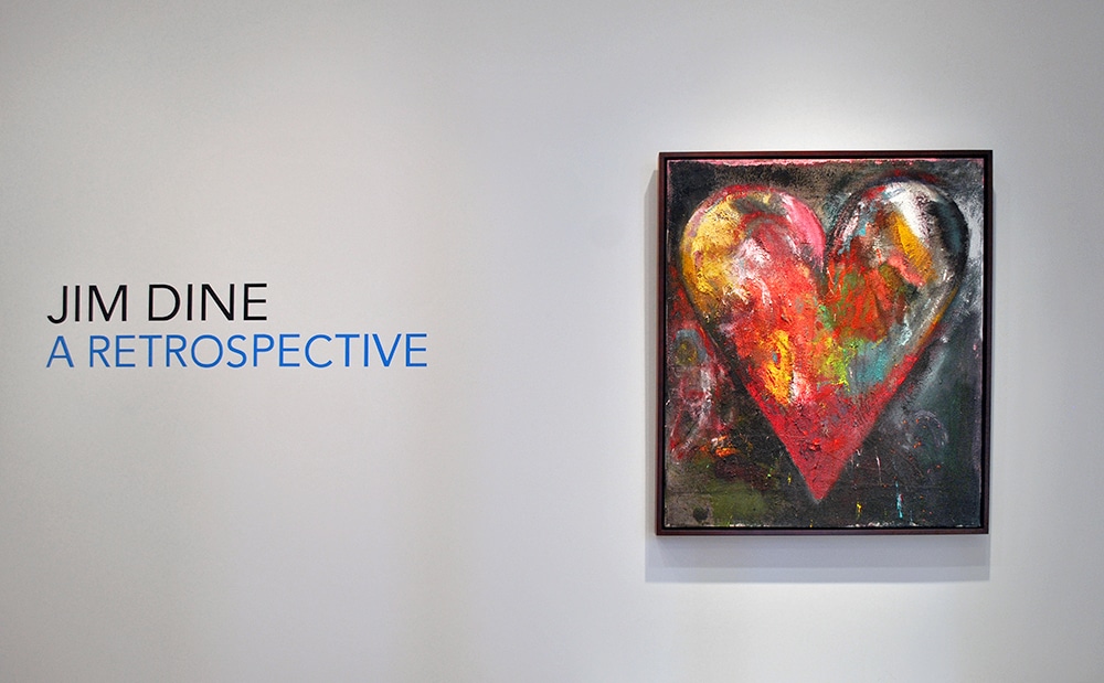
JIM DINE: A RETROSPECTIVE
January 20 – March 31, 2017
Jim Dine: A Retrospective brings together important works from key periods in the artist’s career. Comprised not only of paintings and monumental sculpture, but also unique works on paper as well as dynamic prints, the exhibition charts Dine’s energetic exploration across a wide array of mediums. Beginning with his early works often associated with the Pop Art movement, and tracing his work to the present, these pieces exhibit Dine’s iconic visual vocabulary including hearts, robes, tools, plants, and Venus de Milo. Additionally, recent abstract works represent an exciting new expression of Dine’s creative capacities.

DINE’S EARLY CAREER
After moving from his hometown of Cincinnati, Ohio, in 1958, Dine quickly established himself in the post-war New York art scene, first with the Happenings movement at the encouragement of mentor Allan Kaprow, and later—tangentially—with the Pop Art movement. Although Dine draws upon images of popular culture similar to those consumed by Pop artists, his use of these objects does not serve the same impassive, ironic sensibility. Instead, Dine’s repetition of a concise visual lexicon with his signature expressionist style continues to nuance once-common forms with personal meaning.
PAINTINGS
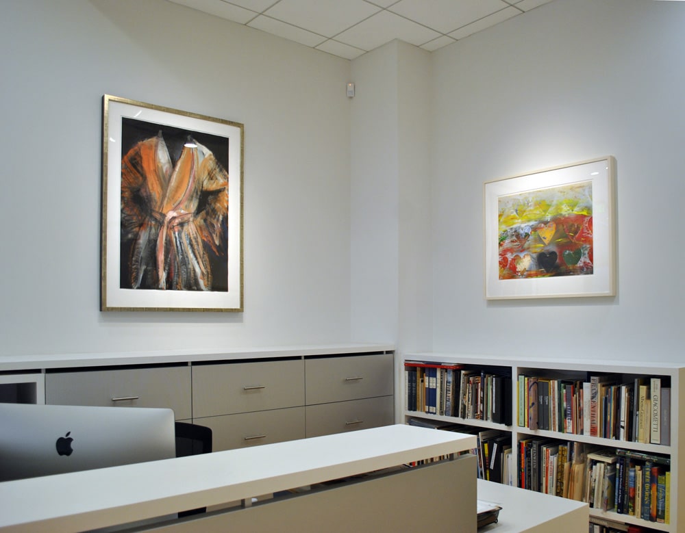
The works included in this exhibition not only demonstrate Dine’s creativity across mediums but also within a given discipline. Dine’s paintings on canvas, panel, and paper often incorporate materials such as charcoal, sand, and collaged elements to depict his iconic forms.
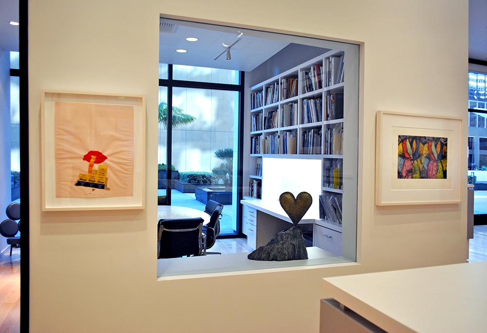
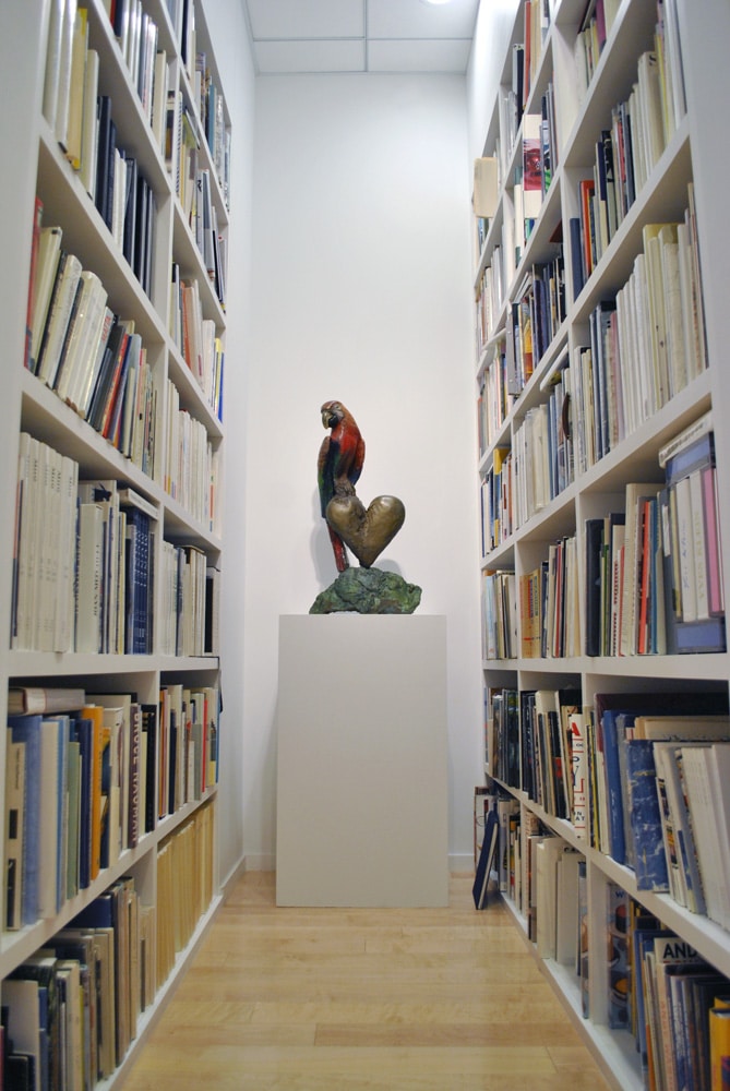
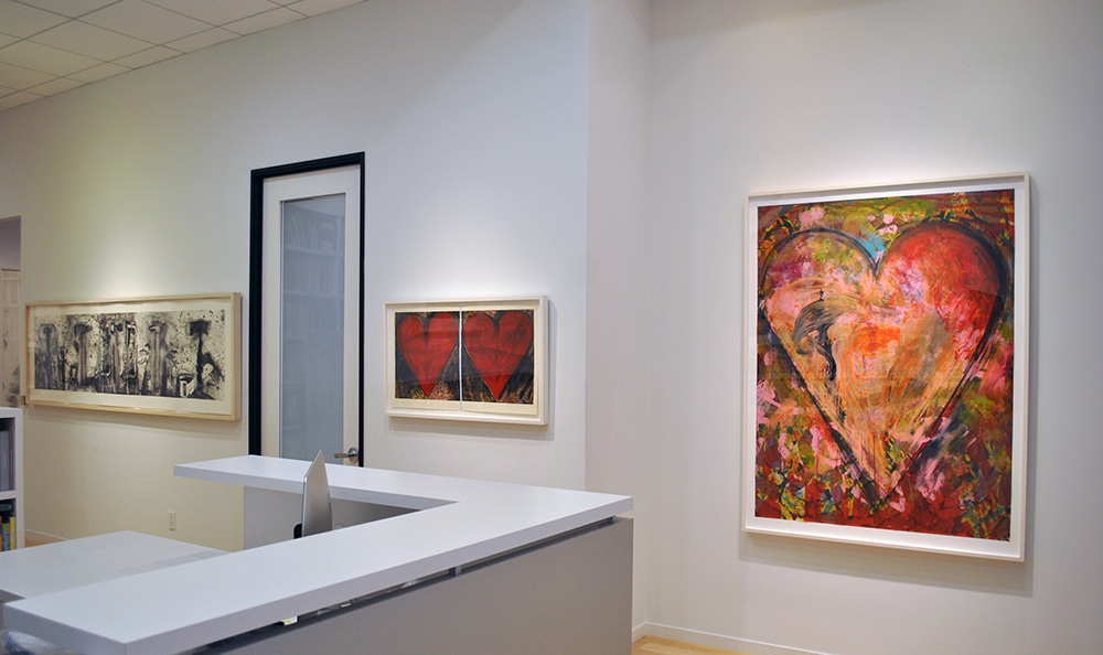
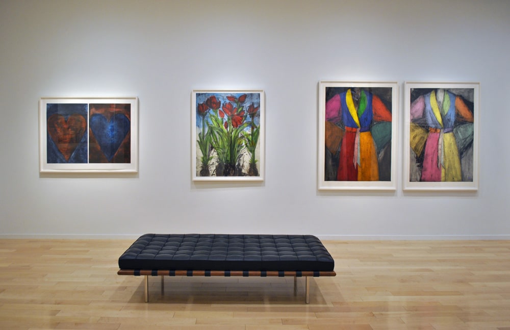
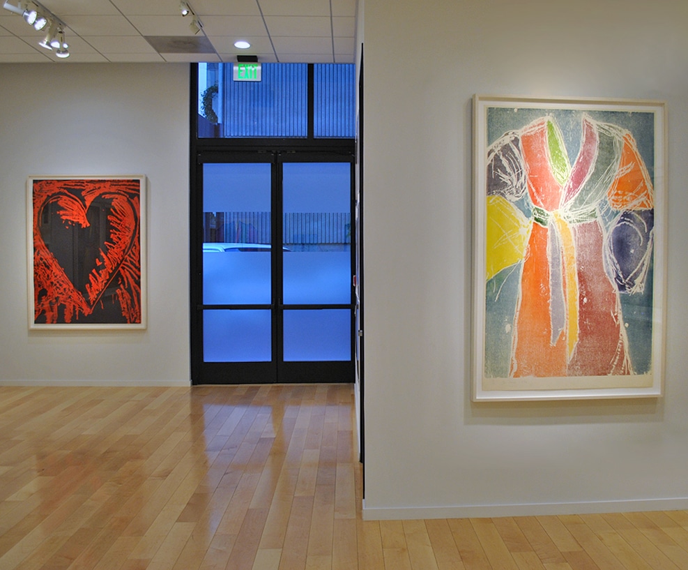
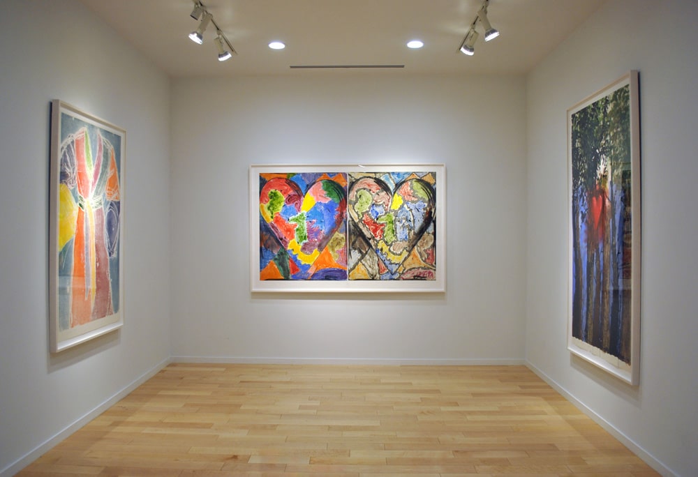
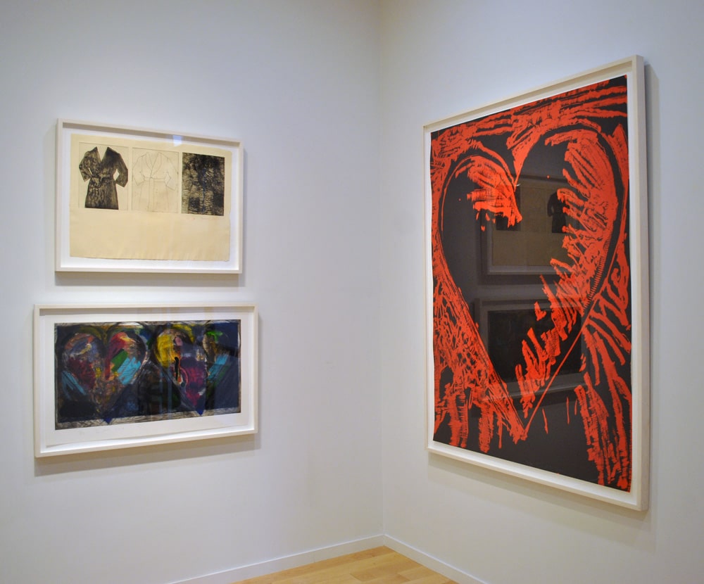
After painting his first heart in 1966, the symbol became a central theme in Dine’s work. A self-described romantic artist, Dine sees the heart for its obvious connection to the strong emotions of love, but also values it as a geometric framework with which he can explore dynamic color relationships and textures. Gossip (1970-71) incorporates collage elements characteristic of some of Dine’s earliest works on paper along with cutout hearts and hand-applied coloring. The resulting work plays positive and negative space against one another to define the shape of the heart amongst evocative textual elements set within a matrix of numbers, which suggest but elude meaning. While Gossip examines the spatial and linguistic capacities of the heart icon, Tricky Teeth (1970-71) uses the form to address color relationships. Here, a flat, black heart is fixed within a pulsating passage of vibrant colors. While the punched lettering of the title is representative of Dine’s penchant for typographic exploration in his early works, the field of color anticipates some of his most recent abstractions.
In addition to color and form, the heart also allows Dine to explore texture. Brought together in this exhibition, the scraped-smooth surface of Hearts in the Meadow (1970) offers a tactile contrast to Dine’s more recent pairing of hearts entitled And the Cherry Trees (2014). With this painterly work, Dine continues to reinvent the form. The artist’s assertive brushwork is heightened by a rich and grainy texture built up with the incorporation of charcoal and sand, endowing one of his most iconic images with fresh and exciting energy.
Pepper (A Crime) boasts Dine’s ability to explore new artistic territory while maintaining his authorial visual style. In this powerful work, Dine’s expressionist energy is freed from geometric form. Colors vibrate against one another in organic, cell-like shapes before blending into dense layers.
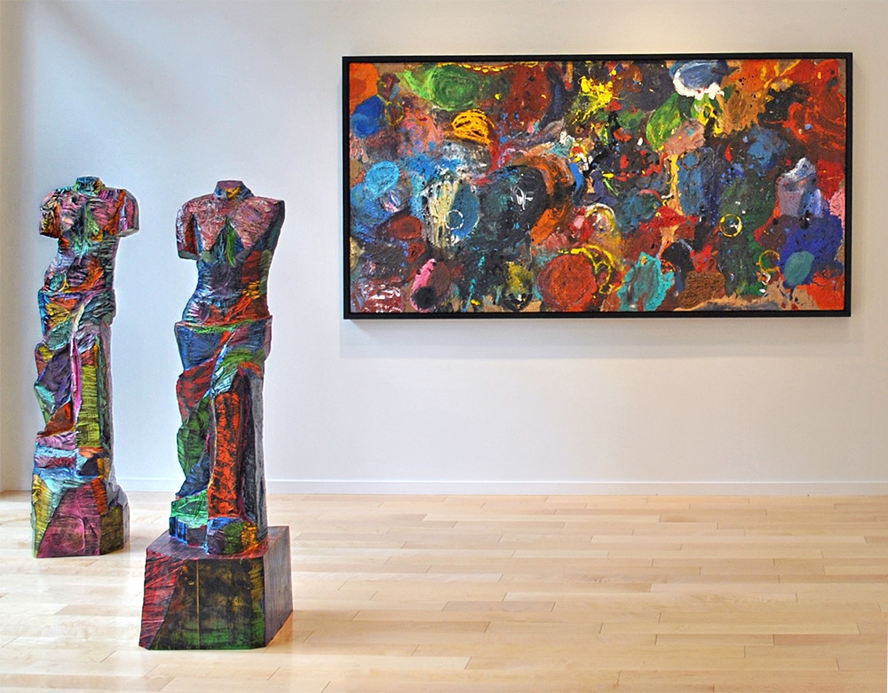
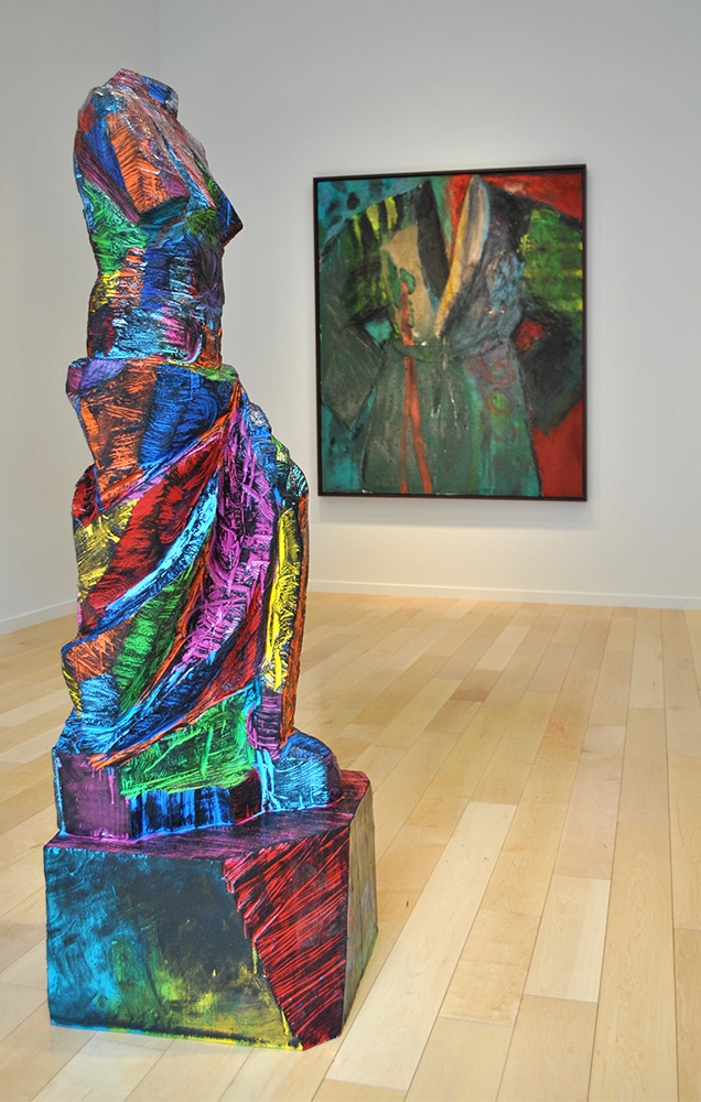
SCULPTURE
In the 1980s, Dine began incorporating the Venus de Milo in his work as a visual link to the great themes and traditions of western art history. To develop his own style, Dine first removed the head from a plaster-cast tourist replica, then worked and re-worked the forms of the body—often incorporating cubist-inspired breasts and altering the stance from a coy contrapposto to a confident, frontal stride.
The life size sculptures in this retrospective, Milano and Napoli, visually attest to Dine’s ability to endow the iconic figure with vastly different significance and emotion through slight variations of form and hand-applied enamel finishing. This contrast is echoed by the works’ titles, which evoke the cultural differences between Northern and Southern Italy.
With Five Colorful Dancers, One Bronze Heart, Dine playfully exaggerates Venus’ posture even further to create a rhythmic repetition of female forms centered on his iconic heart. The hand-applied patina and enamel lend this work an atmospheric quality that links the timeless notions of female beauty and love with Dine’s novel composition.
PRINTS
Like his work in bronze, Dine approaches printmaking as an opportunity to focus his creative energy on small editions of works that are often experimental in technique and finished by hand—rather than reproducing preexisting works in large numbers.
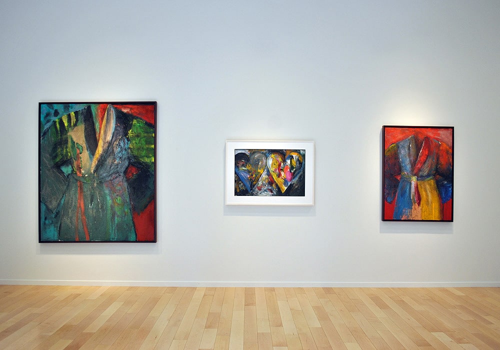
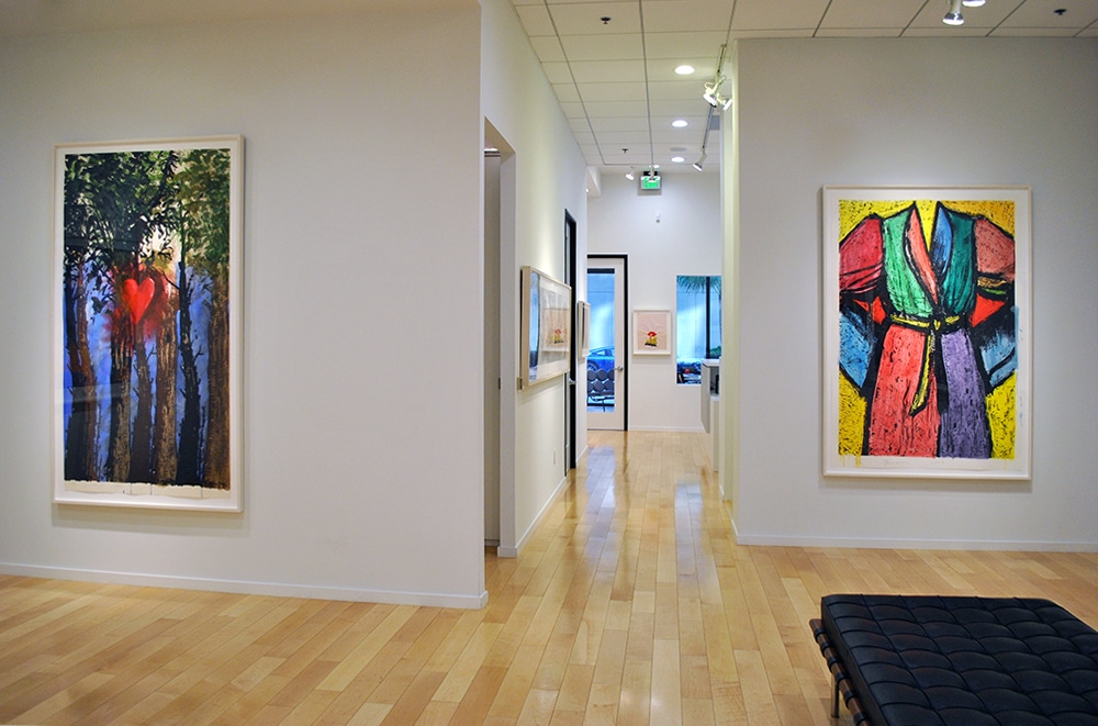
Acting as a masculine counterpart to Milano and Napoli, Dine’s 1995 prints included in this retrospective, Very Picante and Pale Self, contribute a pair of related yet diverse works to his ongoing investigation of the bathrobe as a visual theme. Dine’s first bathrobe image was adapted from a New York Times advertisement in 1964. His subsequent variations on the bathrobe in a variety of mediums have redefined the image as a metaphorical stand-in for the artist. For these two prints, Dine used both relief and intaglio printing to achieve a sandy, smoky texture combined with powerful fields of saturated color. Through the use of 14 individual plates, Dine creates distinct harmonies of color from the contemplative pastels of Pale Self to the buoyant hues in Very Picante.
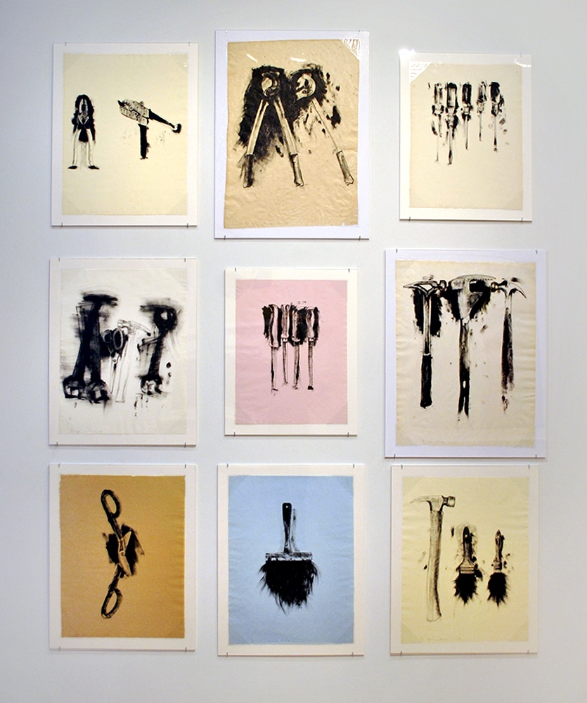
In addition to hand-applied color, Dine often experiments with combinations of printmaking techniques and implements. With Aldo Behind Me represents Dine’s inexhaustible exploration of the medium. Here, the artist has revisited plates originally made in collaboration with legendary French printmaker Aldo Commelynck and re-worked them using a wide range of techniques including aquatint, etching, drypoint, and mechanical abrasion to depict hand tools and paintbrushes. The result is a visual elegy for Dine’s life-long friendship with the printmaker also known for his work with earlier Modern artists including Picasso and Matisse.
Dine’s restless experimentation with print techniques often blurs the lines between mediums. With It’s A Drawing, It’s A Print, what begins as a multi-color woodblock print is finished with hand-applied charcoal drawing. The Grand Carpet further conflates categories by combining woodcut relief printing and drypoint intaglio on copperplate with single-reproduction monoprinting. The resulting works, although belonging to a small edition, are each unique in their own right. Finally, with The Forest Up North, Dine pushes printmaking to rival the scale and ambition of his paintings by combining a hand-painted heart floating amongst a vast forest of printed trees.
RETROSPECTIVE, PROSPECTIVE
The pieces brought together by this retrospective demonstrate Dine’s continued ability to redefine his personal visual repertoire that has become so iconic, and—perhaps more importantly—to push beyond those forms in exciting new ways. The innovation and experimentation across mediums represented by the exhibition further expand traditional notions of Dine as painter, sculptor, and printmaker.
Jim Dine: A Retrospective will be on exhibit through March 12, 2015
All text and photography is © Jonathan Novak Contemporary Art.
CLOSEUP FEATURES
Jim Dine Hearts [February 11, 2015]